External Nomination
Portal
IBM Sponsor User Program
The Partner Portal was conceived to allow IBM Business Partners the opportunity to nominate their clients for the Sponsor User Program. The Portal would be a vehicle to educate Partners on what the Sponsor User Program is, and the opportunities it presented for them and their clients. The initial goal was the creation of a new form that allowed Partners to nominate their clients for the Sponsor User Program. After evaluating the to-be scenario, two additional forms were added. The first would allow Partners to self-nominate, and the second to facilitate direct contact between the Sponsor User team and Business Partners. The second form would additionally allow us to monitor the regularly required inquires, giving our team insight into future expansions of the Portal. An education section based on the one currently existing in the internal Portal was eventually expanded and refined to match the new pool of users and allow greater universal accessibility.
In addition to the business requirements of this project, I approached it with a plan to expand my personal time management and organizational skills. I was also excited for the opportunity to build a net new product and to learn the as yet unfamiliar Carbon Expression design language. Being the sole designer of this Portal, I was also able to expand my skills in developing the story and requirements for a new project and the content design needed throughout. I was also looking forward to applying my personal research and knowledge on accessible, inclusive design from the initial build of a new development.
Planning
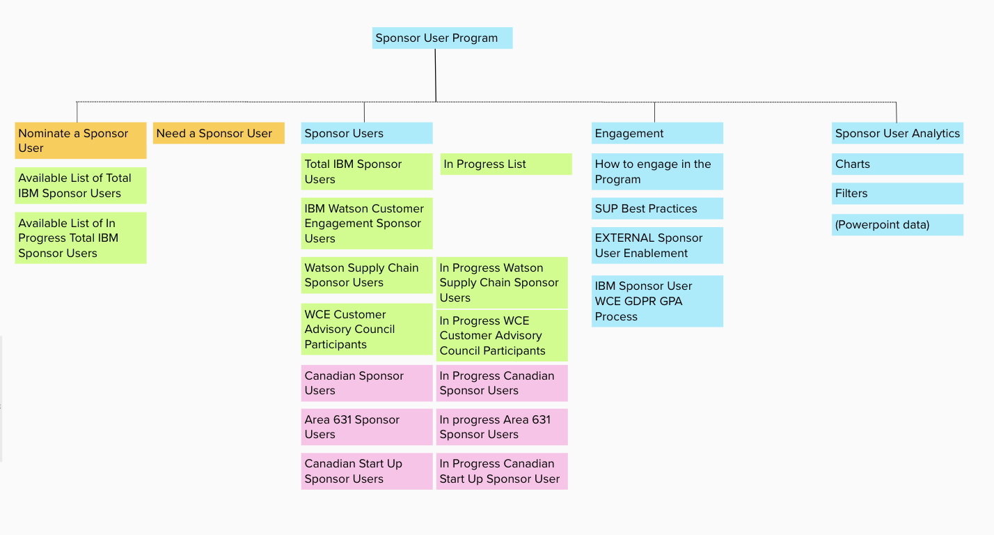
The first flow covered the to-be scenario and any needs and problem areas of the nomination process.
The second flow was more of a step by step view of what each page in the process would be. This flow helped give some insight into the pages I needed to build, and the places where obstacles may occur.
This also particularly helped flesh out the Question page, as it was a net new contribution to the application, and we wanted to be able to track the use of it to allow for better incorporation of future features in the page.
Prototyping
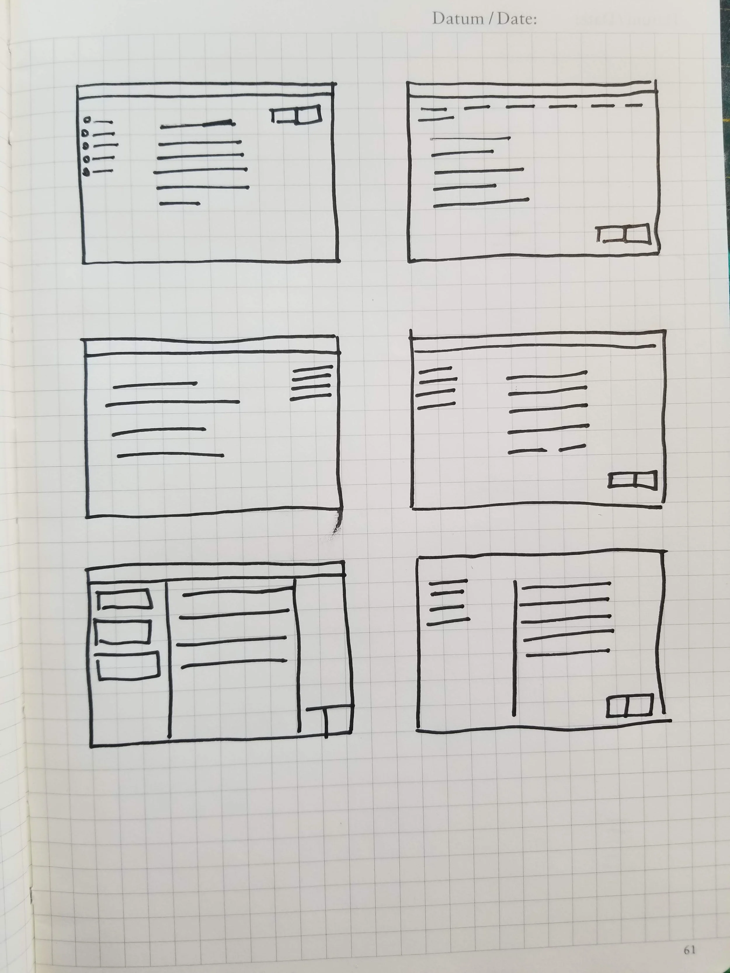
I prepared to build this project by looking over the internal portal, the flows and problem statements I had built, and the Carbon Expressive design language. From there I was able to sketch out some concepts of what the pages could look like and where components could be laid out.
There was a real challenge when translating this to the Carbon Expressive system, as it had primarily been built for webpage design, not long multipage forms, so making all the components, grid and layouts work in a slightly different setting proved to be an exciting challenge.
I did eventually build a few custom symbols for this project, but that was further in when it became much more imperative that certain menus be easy to adjust and change to apply to all pages of the design, easing my work down the road.
Final Design
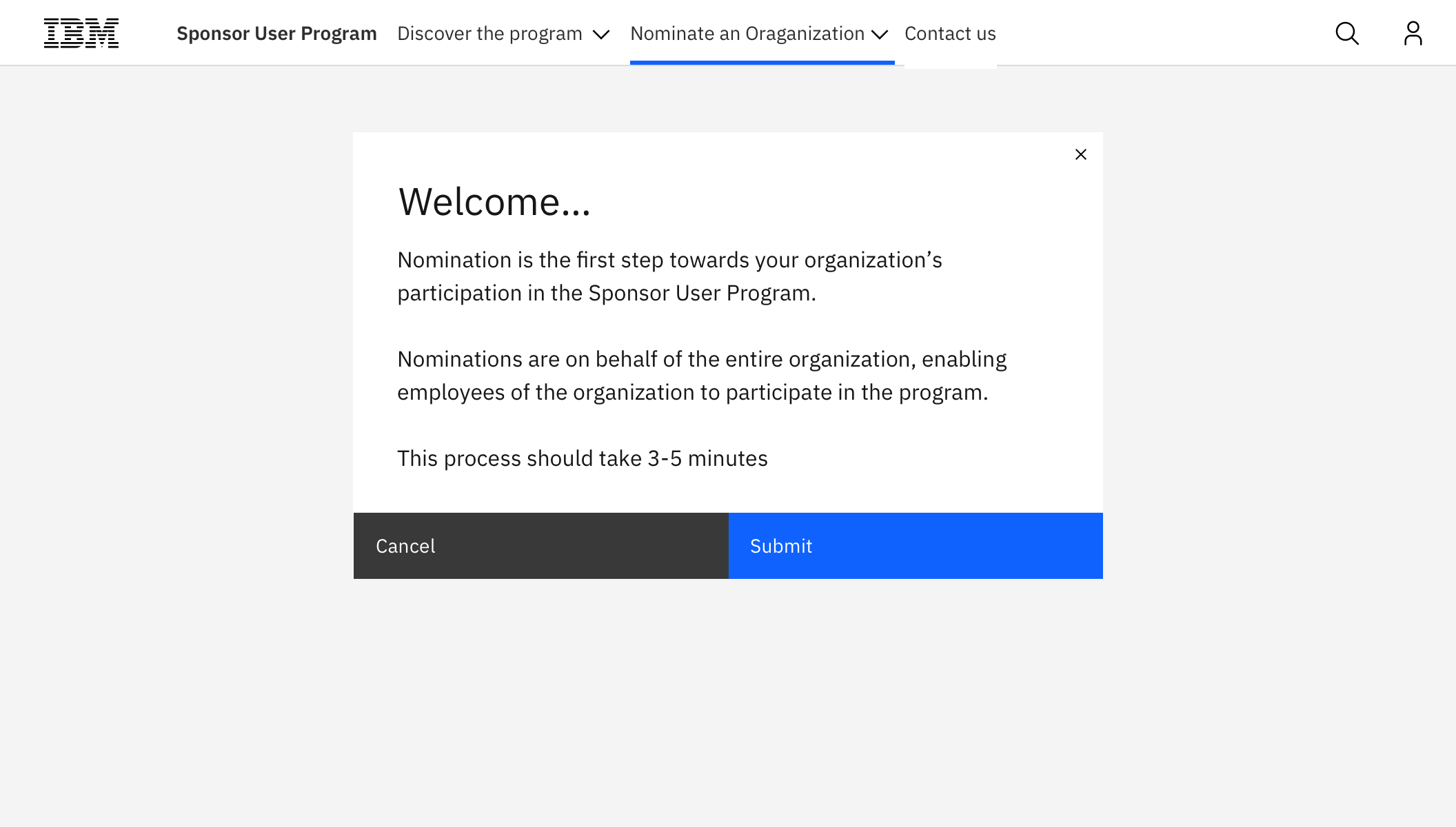
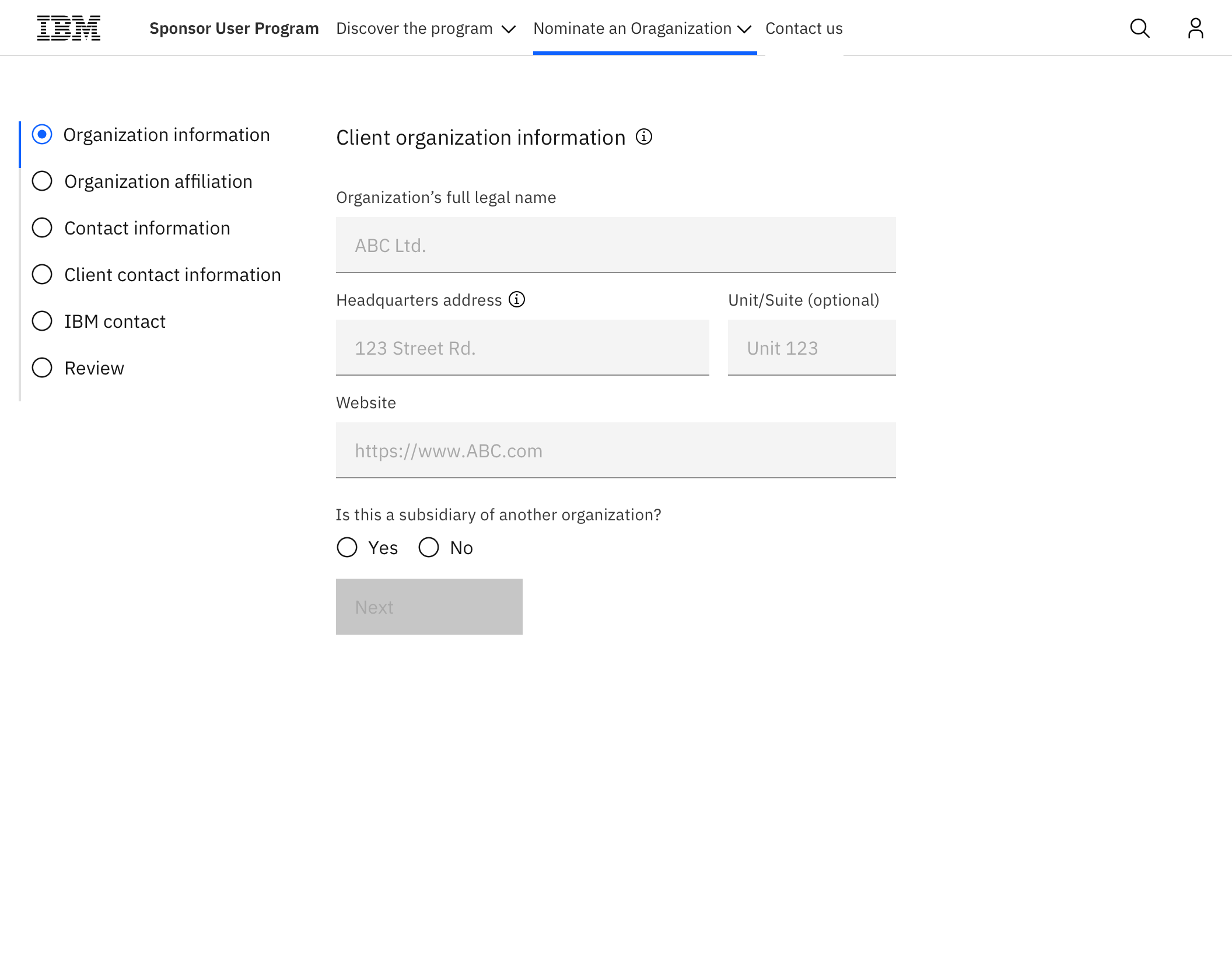
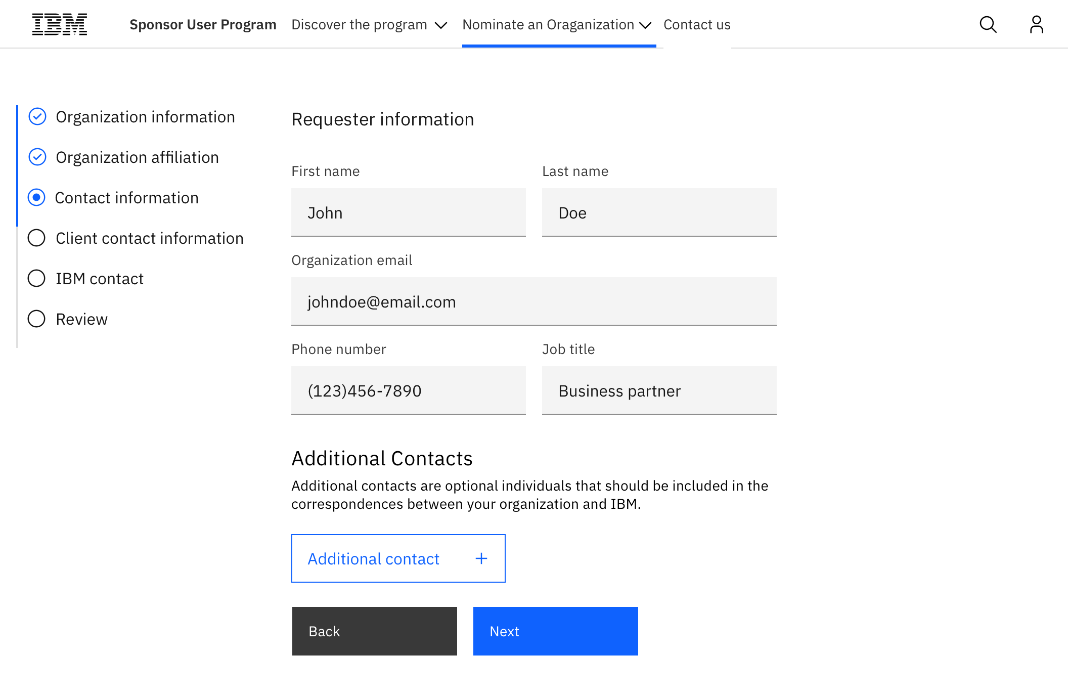
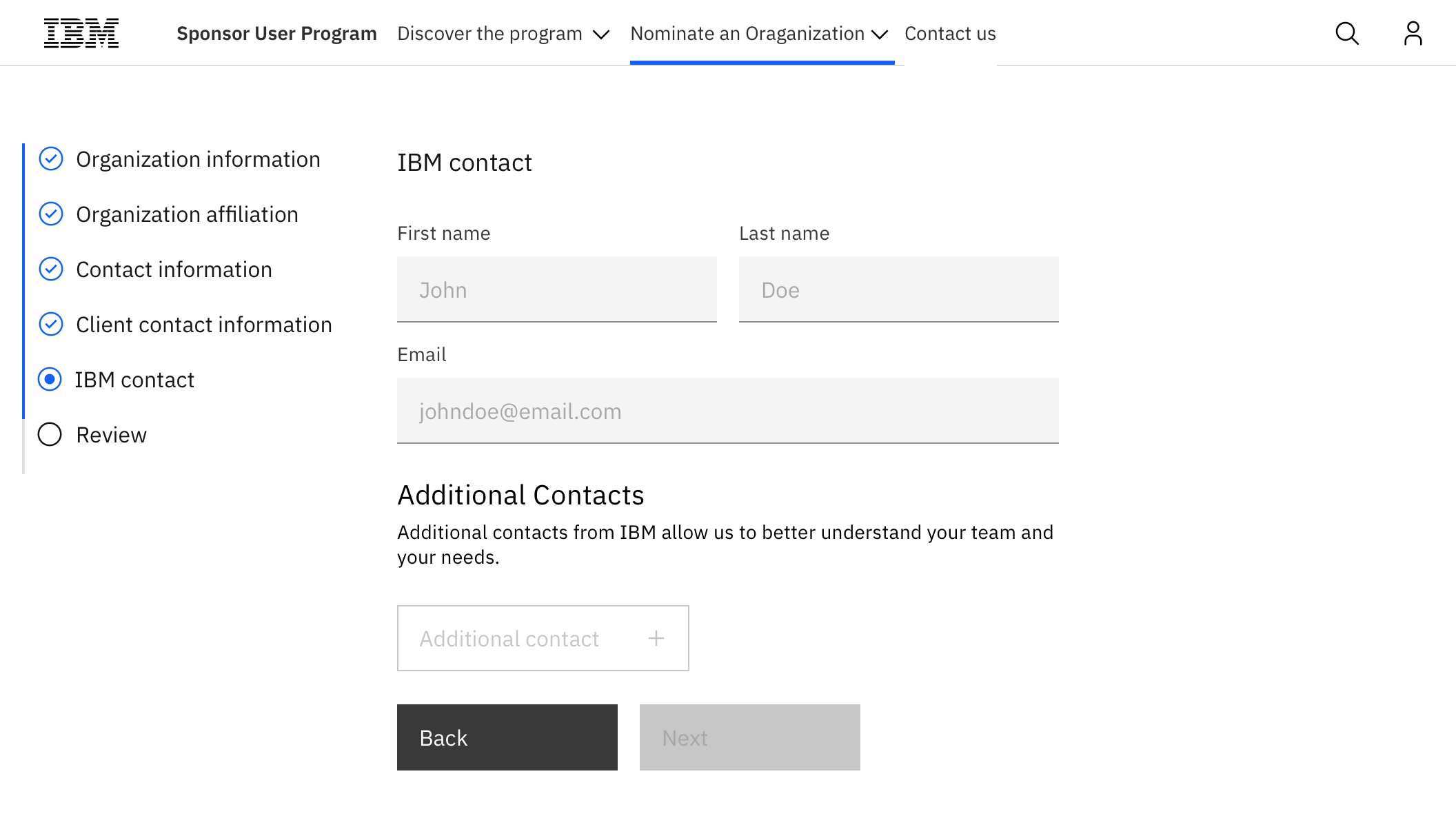
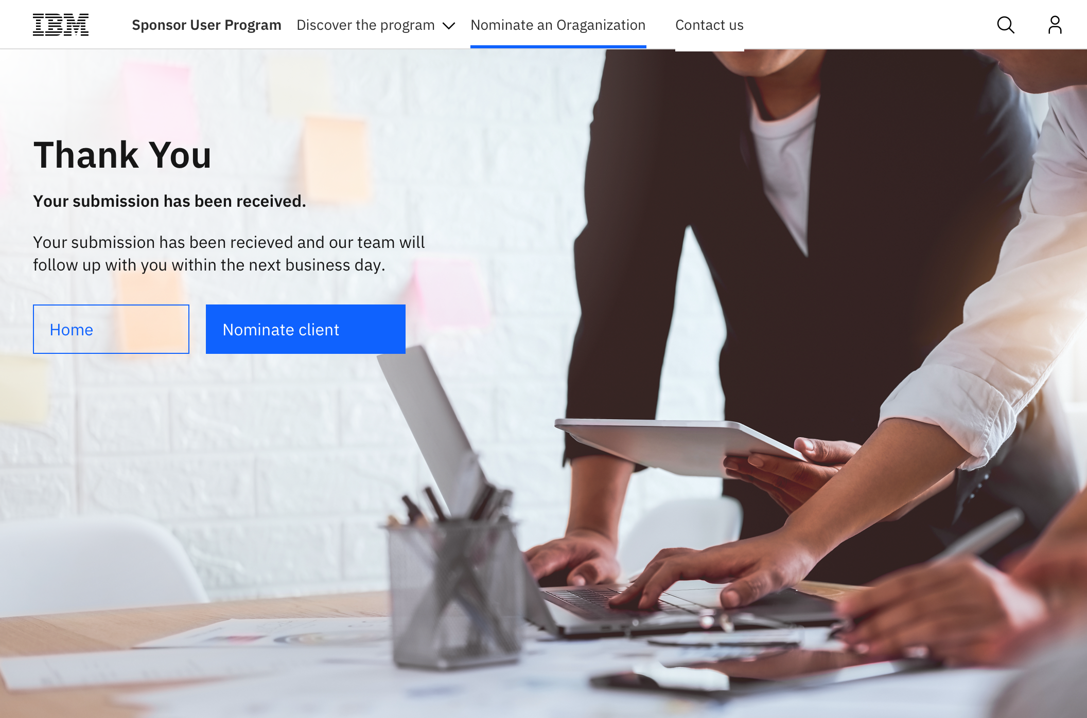
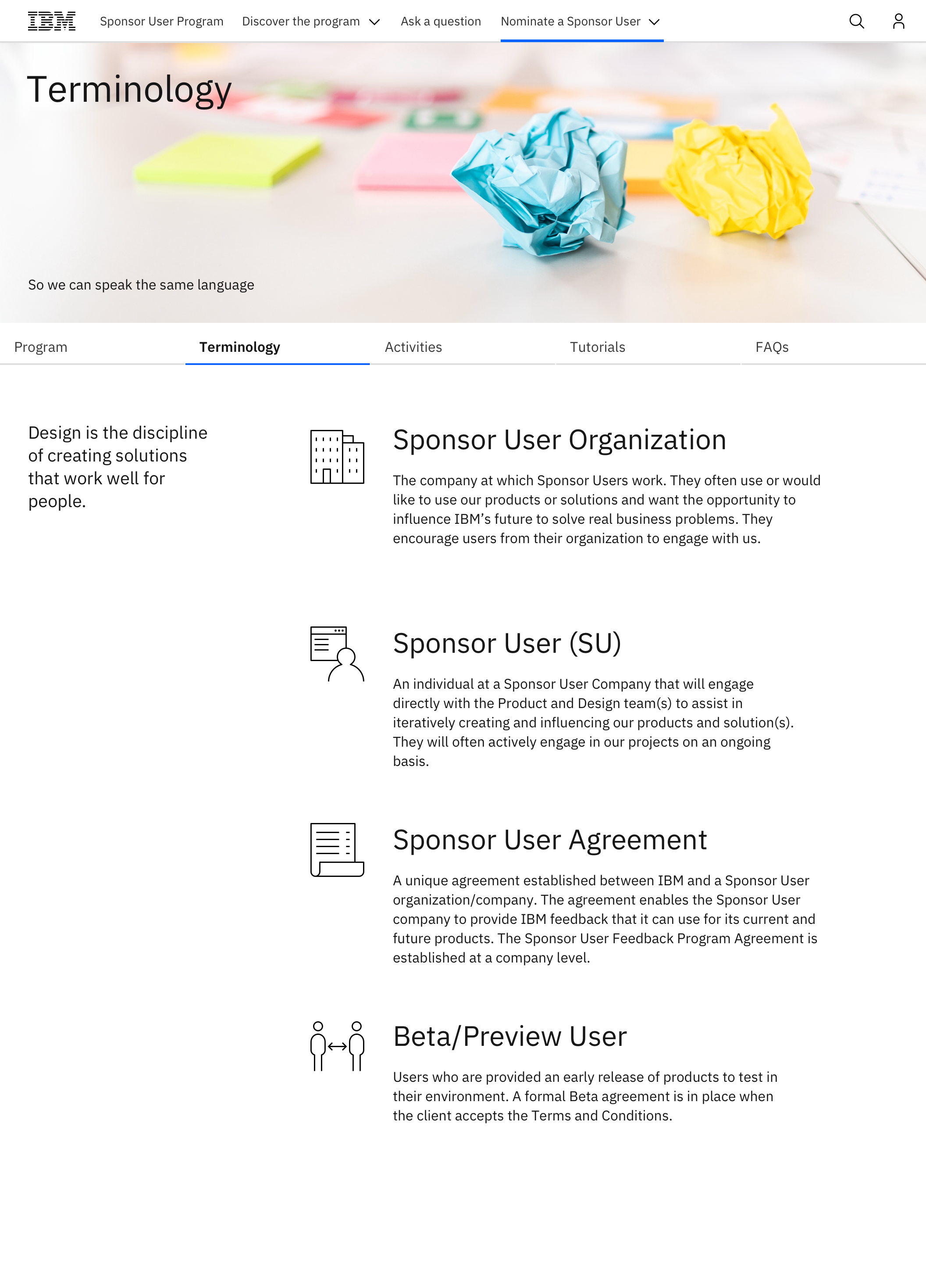
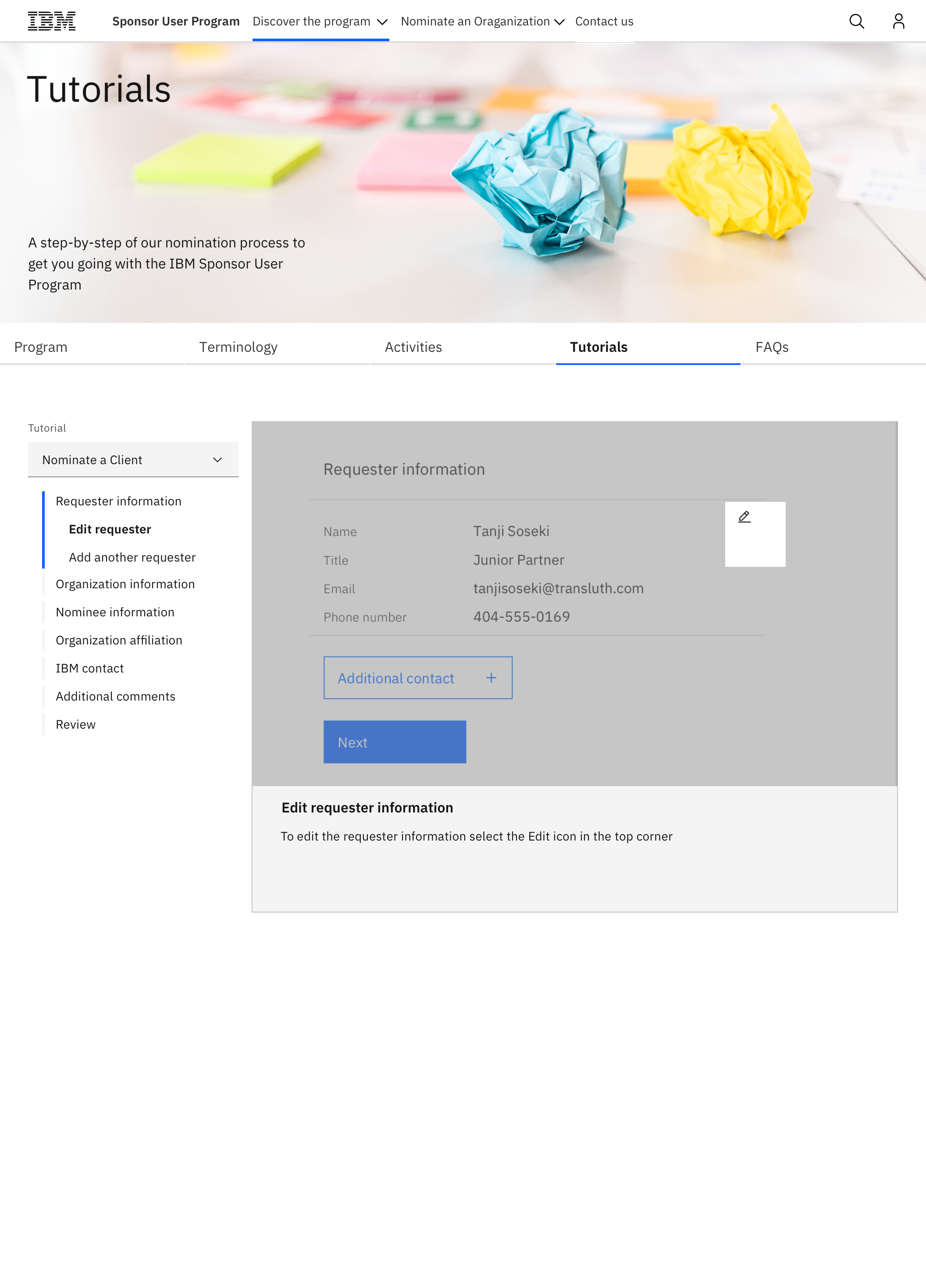
The final result of this design process was a total of 5 sections, 3 forms and a total of 53 screens made pixel perfect after many iterations
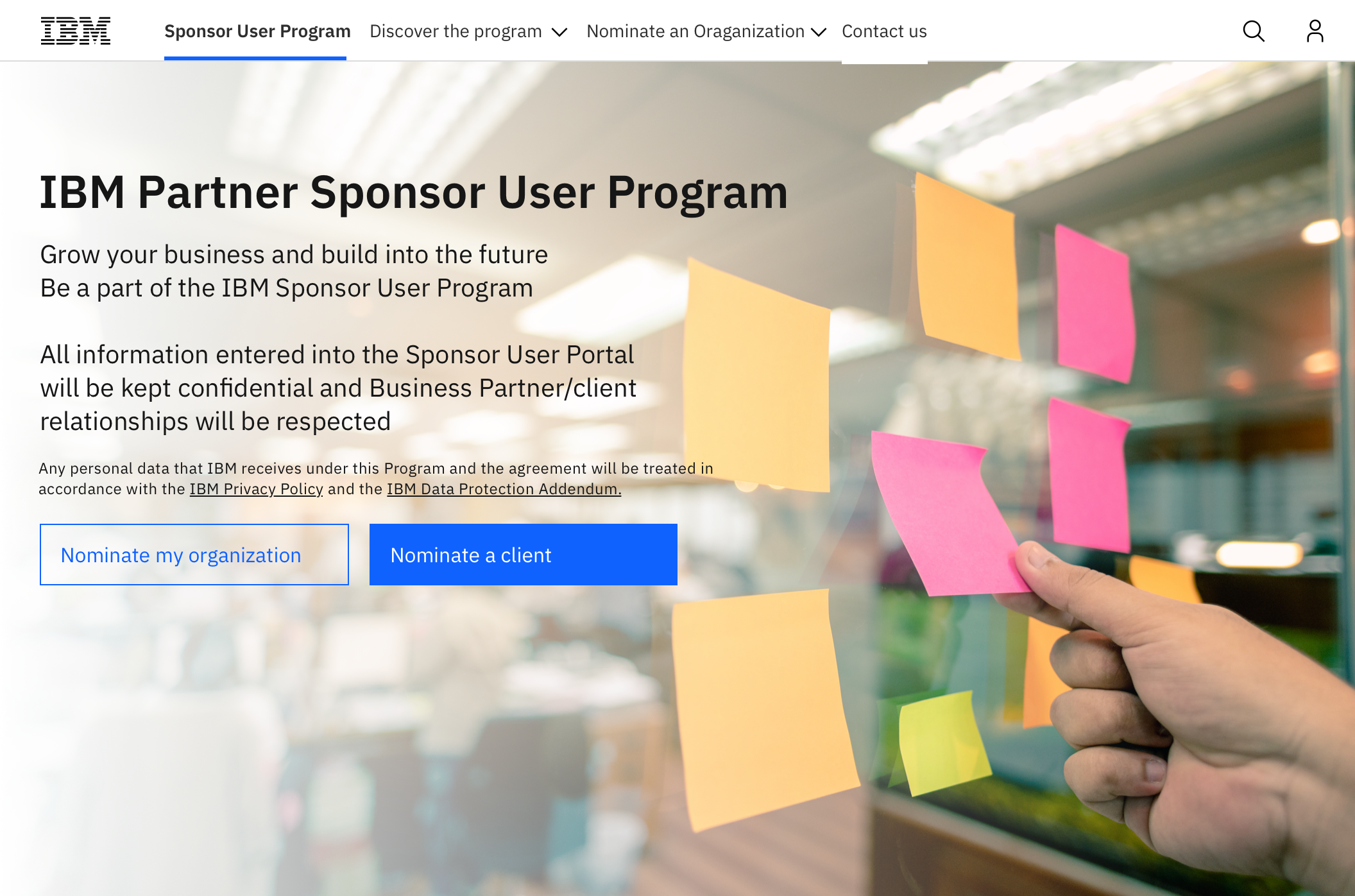
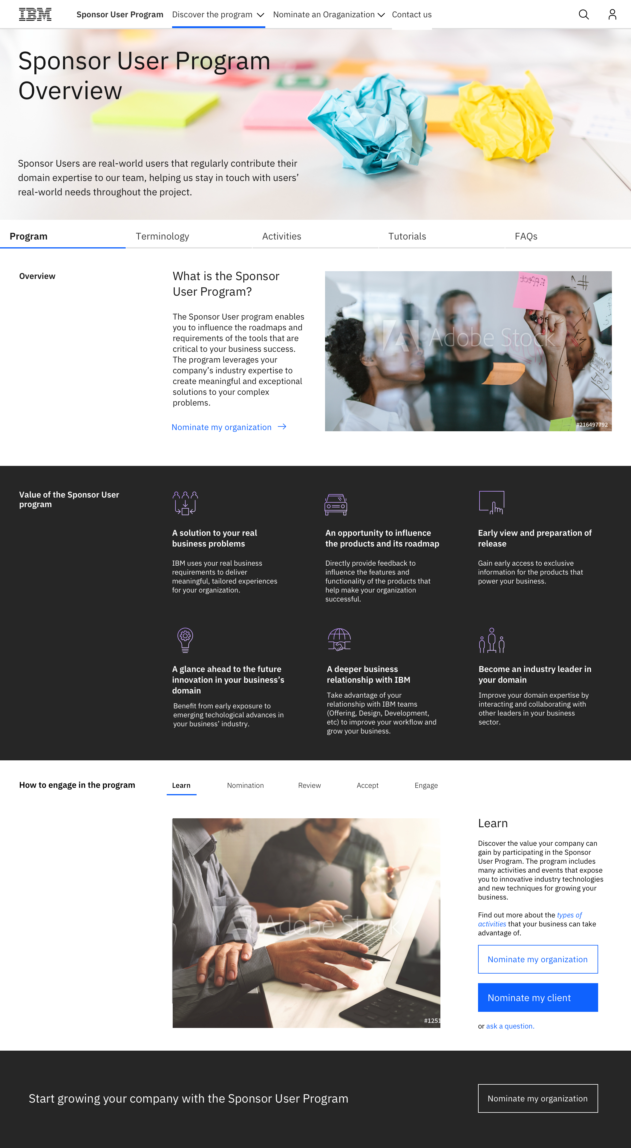
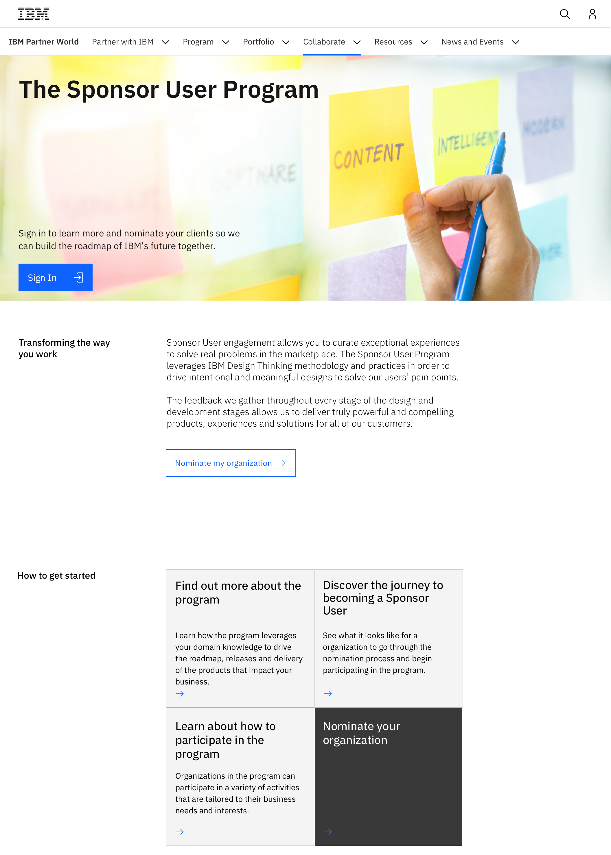
This page was designed to match the IBM.com carbon expressive design template, rather than the Carbon design method that I had previously been accustomed to. Building it involved a lot of research into other IBM.com pages, and close collaboration with my coworker, who was simultaneously building a portal for the Sponsor User Program on IBM.com. The main challenge was that a lot of the templates and components weren't built for forms or sign up, but rather informational purposes. This meant that creativity was required to match the style of the language, while also allowing for a proper flow and use.
It was an exciting challenge to get to build in a new system and learn its ins and outs, with the final design improving with each pass and check-in. It was a fun change of pace to get to design for the web rather than for applications, meaning that space, colour and calls to action were more vital than building to the applications a user is accustomed to. Creating a story through imagery was a challenging new endeavour, with our themes switching from space, to roads, to generic business and finally evoking design thinking workshops using pictures of sticky notes and diverse teams, calling to the activities they would be doing as a Sponsor User.

