
Repositioning a Flagship Mattress PDP for the Luxury Tier:
An AI-Assisted Design Process Built for Reuse
A case study in verified research, restraint as a luxury strategy, and treating prompt engineering as a design discipline. Client details have been generalized; the process, decisions, and results are presented as executed.
The Challenge
Reposition a direct-to-consumer sleep brand's flagship product detail page for the luxury tier — and do it with a process that holds up to scrutiny. The brief was an opportunity to demonstrate two convictions that run through all of my work: that verification beats assertion, and that the most valuable deliverable is never the page itself — it's the system that lets the next designer build the next page.
The central thesis: in the luxury category, restraint is the confidence signal. Stacked promotions, countdown timers, badge clutter, and comparison upsells are the visual grammar of the value tier. A luxury repositioning doesn't add signals — it removes them, and lets the product carry the page.
Phase 1
Competitive Research: Designing the Prompt Before Running It
“Their attention to detail and commitment to quality truly stood out. We’ve already recommended them to others.”
The Scope
Thirteen brands — the luxury mattress competitive set plus an adjacent study of luxury bedroom furniture — analyzed across typography, color and tone, layout, UI patterns, and technical foundation, with platform identifications confirmed via markup evidence rather than assumption.
The Guardrails
The prompt explicitly permitted "no public data available" as an answer, prohibited estimation, and required confidence labeling on technical-stack detection. Anti-hallucination guardrails aren't decoration; they're what makes the output usable as a decision-making foundation.
The finished report flagged the brand's own headline revenue claims as self-reported and unverified against far smaller third-party estimates, labeled platform identifications as confirmed only where markup evidence existed, and noted that its promotional observations were captured during a holiday sale period and should be re-verified. These caveats are not weaknesses in the findings — they are proof the guardrails performed as designed.
The Core Insight
came from the adjacent category: restraint is the default in luxury bedroom furniture — an established playbook the mattress category has left untapped. Paired with the emotional/logical shopper split, this drove the entire page architecture: emotional conviction above the fold, logical validation below it.
Phase 2
Design Decisions: Removal as Strategy
-
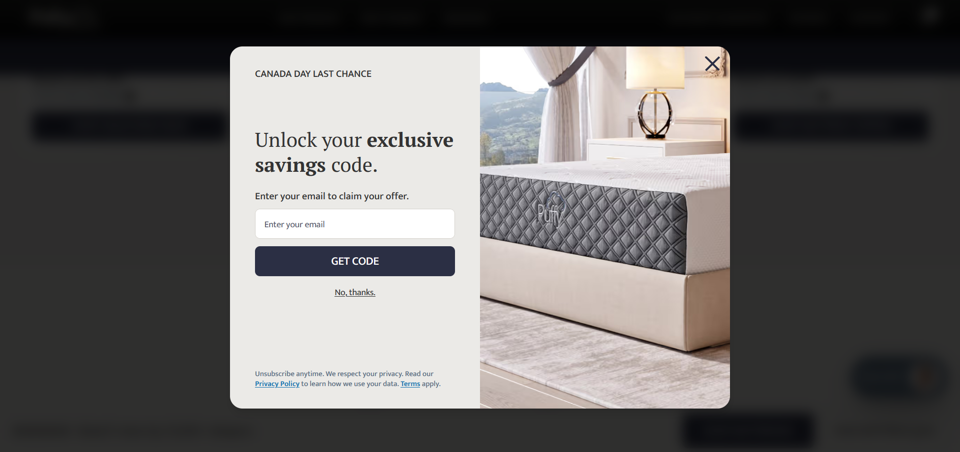
![An email sign-up promoting a coupon code]()
Promotion discipline
Coupons, timers, and stacked discount messaging were removed. Discounts still appear; shown once, when called for, never as the impetus.
-
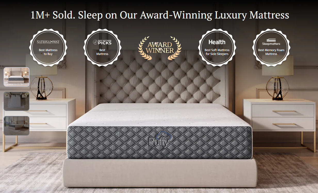
![An image of a mattress cluttered by award and sales points]()
The image speaks for itself
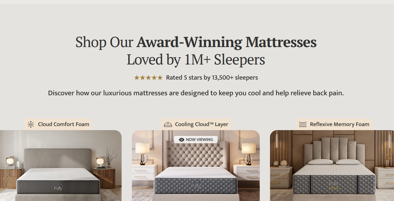
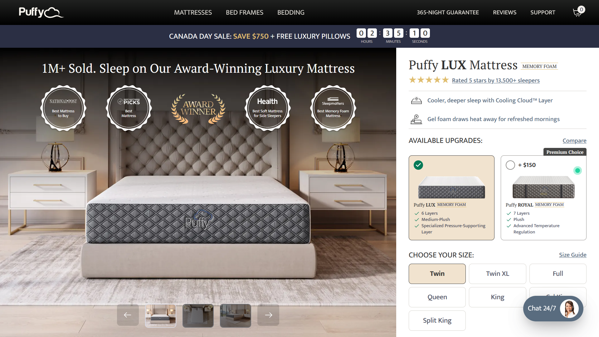
Badges and awards were stripped from the hero; negative space was increased and the product image enlarged. Clutter wasn't just off-brand — it was an accessibility cost.
-
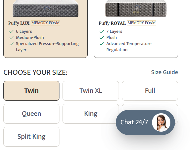
![A chat pop-up covers the size selection section]()
The chat pop-up went
It blocked content, degraded first impressions, and reduced accessibility.
-
![A selection to purchase a more expensive mattress]()
No upsell at the purchase moment
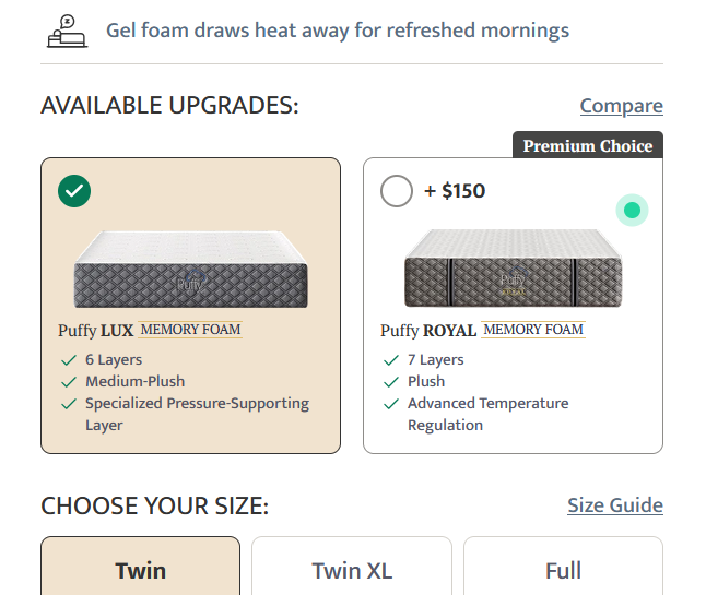
Comparison merchandising on the first fold echoes the value-tier playbook the research documented. The first fold holds a single clear pathway to purchase; a complimentary accessory inclusion remains as a bundle, a distinct thing from an upsell.
-
![Advertisement for purchase conversion]()
Honest measurement over invented impact
Rather than claiming precise conversion lifts, the recommendation commits to holdout measurement with defined reversal thresholds. A luxury repositioning is a measured AOV-and-margin trade, and pretending every metric improves simultaneously would be naive.
Phase 3
The Build:
PRD-Driven and Replicable
The page was generated in Figma Make from a written PRD, then systematized manually in Figma — tokens applied, layers organized and labeled, icons unified to a single system. The definition of done was file hygiene: a stranger could open the file and navigate it, because that hygiene is what lets the next page reference this one.
The PRD-driven workflow was deliberate: it makes the page replicable by junior designers, with the reference file, the prompt template, and a tiered style library forming a documented pipeline for the remaining product lines.
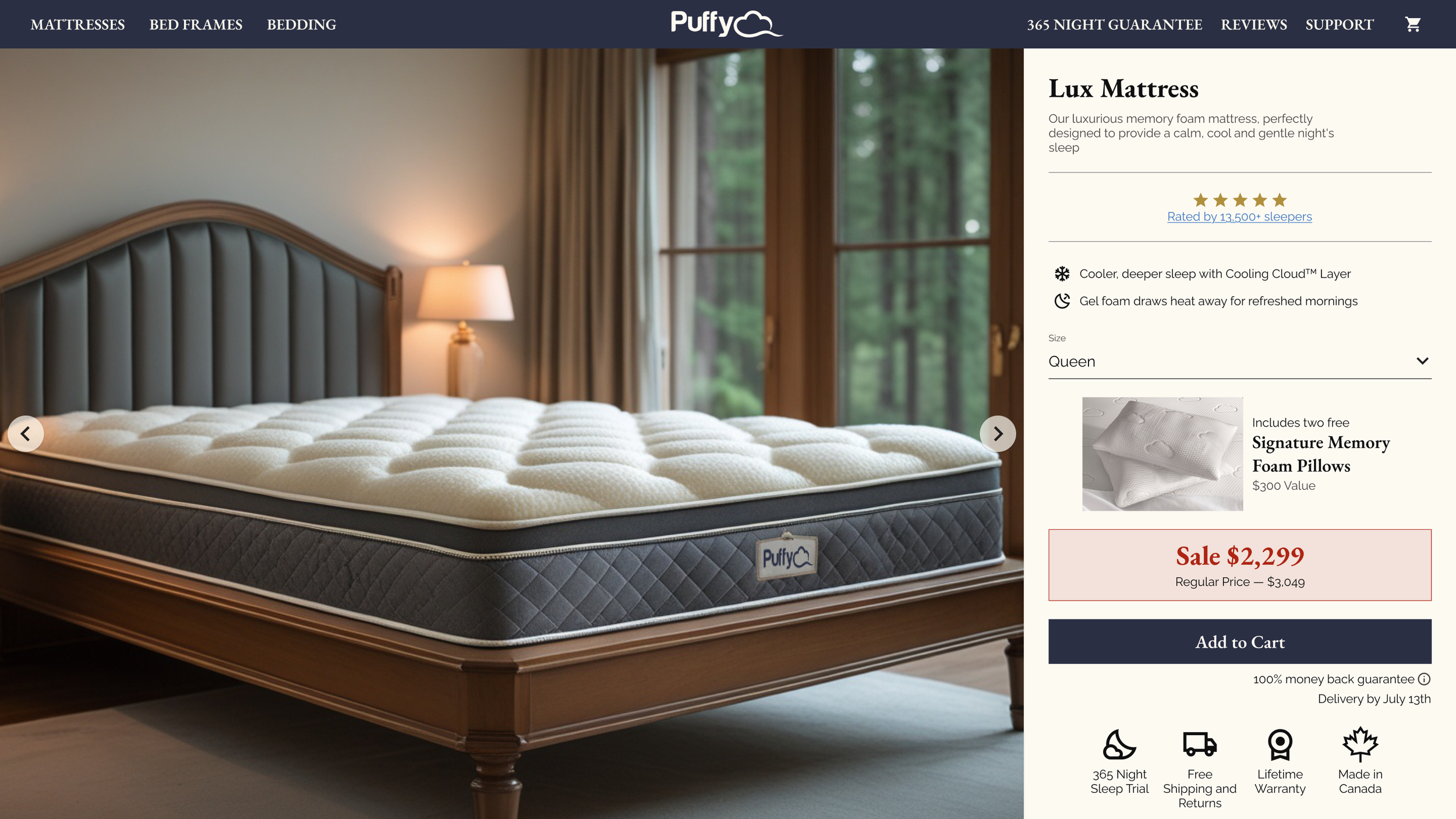
Design Decisions
Key choices in service of luxury positioning
Every major decision on this page traces back to the visual grammar the research identified in true luxury brands and to the specific gaps it found in the current design.
What that Means
A quieter, cleaner canvas.
The chat pop-up was removed; it blocked content, reduced the user's first impression, and created an additional accessibility barrier. Upsells and cluttering imagery were likewise cut, as they added a cheapness the positioning cannot afford.
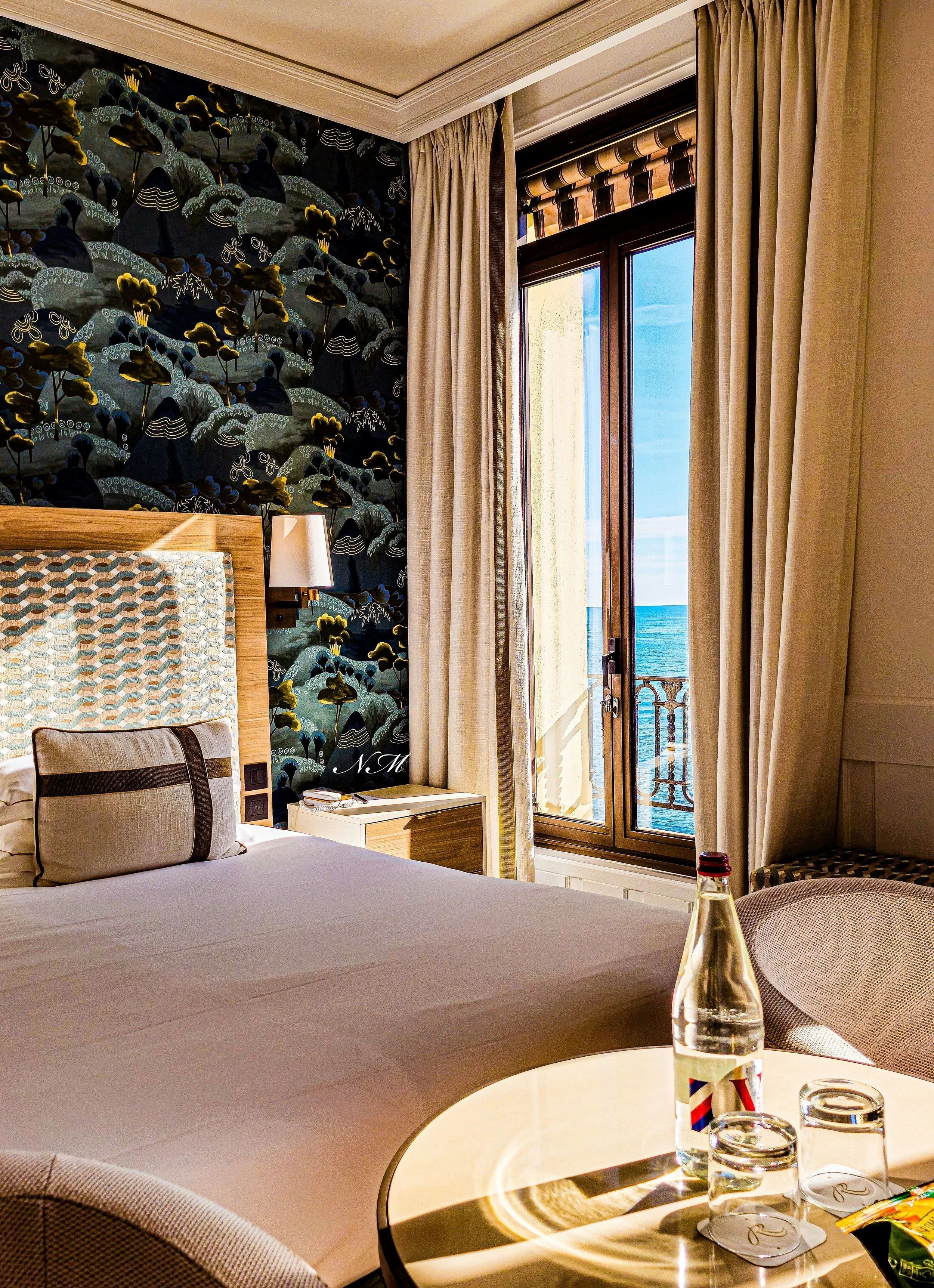
Restraint over promotion.
The most consequential change was the removal of the promotional apparatus that defined the previous page. Discounts still exist, but they are shown once and when called for, never as the impetus to buy. The research was unambiguous on this point: discount mechanics are the single sharpest divide between value-tier and luxury-tier presentation, and no amount of elegant typography can read as luxury above a countdown timer.
Typography as tier signal.
The primary fonts were replaced: EB Garamond, a neat serif, now carries all headings — the strongest single typographic luxury signal the research identified — paired with Raleway, a matching but more readable sans-serif, for body text. The pairing delivers editorial voice where the page speaks and clarity where the user reads.
Letting the image speak.
The hero image was enlarged and given significantly more negative space, and the badges and awards that previously cluttered it were removed entirely — they diminished both the image and the page's accessibility. Luxury furniture brands treat the product as an object of desire rather than a deal, and this page now does the same.
Sharpness as a design language.
Icons were unified under a sharp style, and all radii were removed from buttons and cards. Rounded corners read friendly and approachable — the DTC-tech personality the research found on the current page — while sharp geometry reads precise, considered, and premium. It is a small decision applied consistently, which is precisely how luxury detail works.
Emotional Above the Fold, Logical Below It
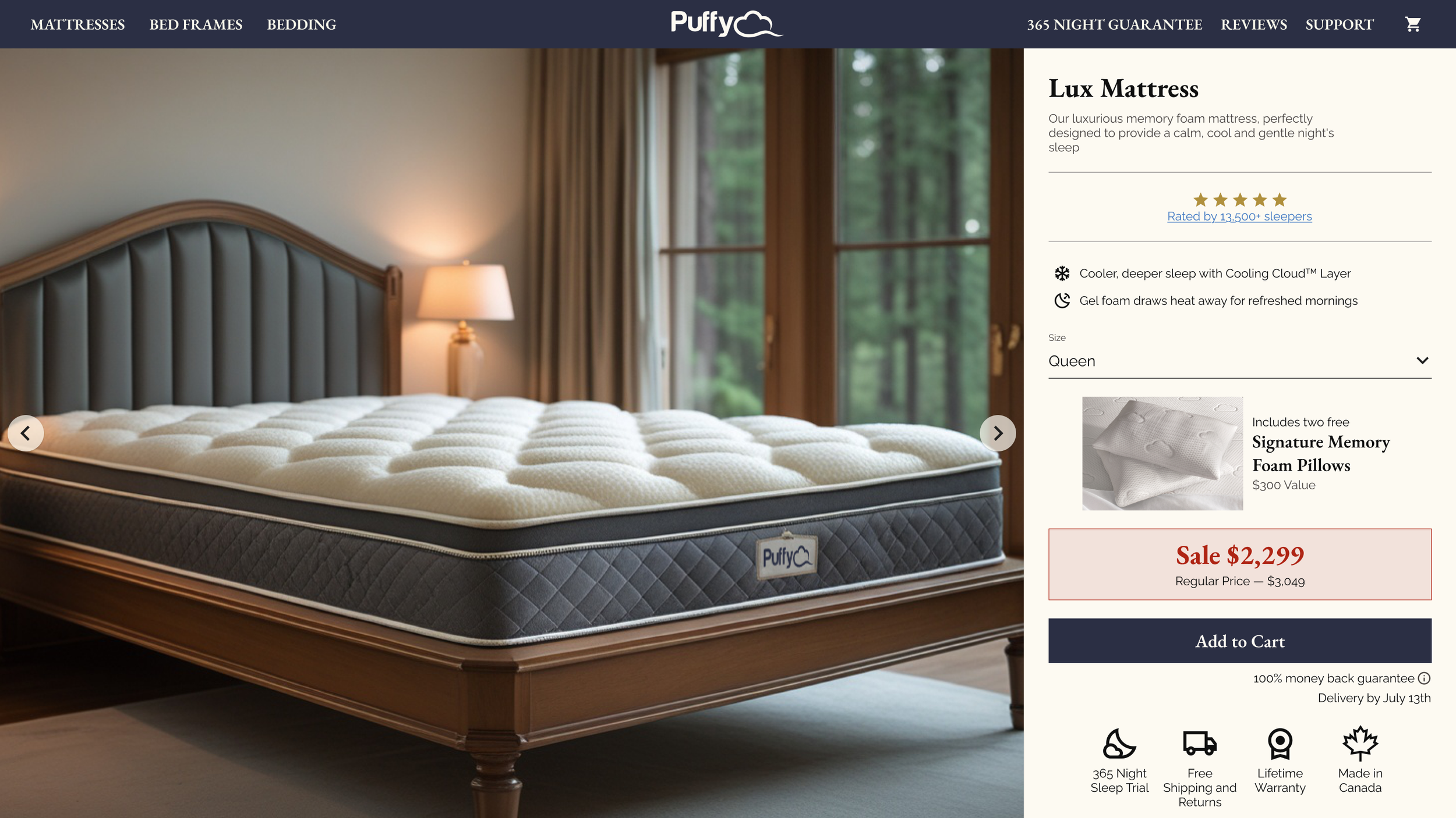
The above-the-fold purchase pathway (the moment of purchase). The previous page did not present all information necessary to purchase above the fold; this redesign does. Size selection is simple, every detail needed for the decision is immediately present, and the Add to Cart button is large, elegant, and easy to access.
The reasoning is behavioral: the purchase moment should be easy and smooth, not stressful. Emotional shoppers tend to decide with what is in front of them — so everything they need lives above the fold — while logical shoppers are willing to work for the proof they require, and in fact expect that work as evidence of reliability. Details, awards, and reviews are therefore placed below the fold, where they serve the logical shopper's due diligence without cluttering the emotional shopper's decision.
The goal is a buyer who feels the decision was easy, which supports both the sale and the post-purchase confidence a 365-night trial depends on.
Systems Built for Reuse, Not One-Off Deliverables
The lasting output of this project isn't a page
It's reusable assets
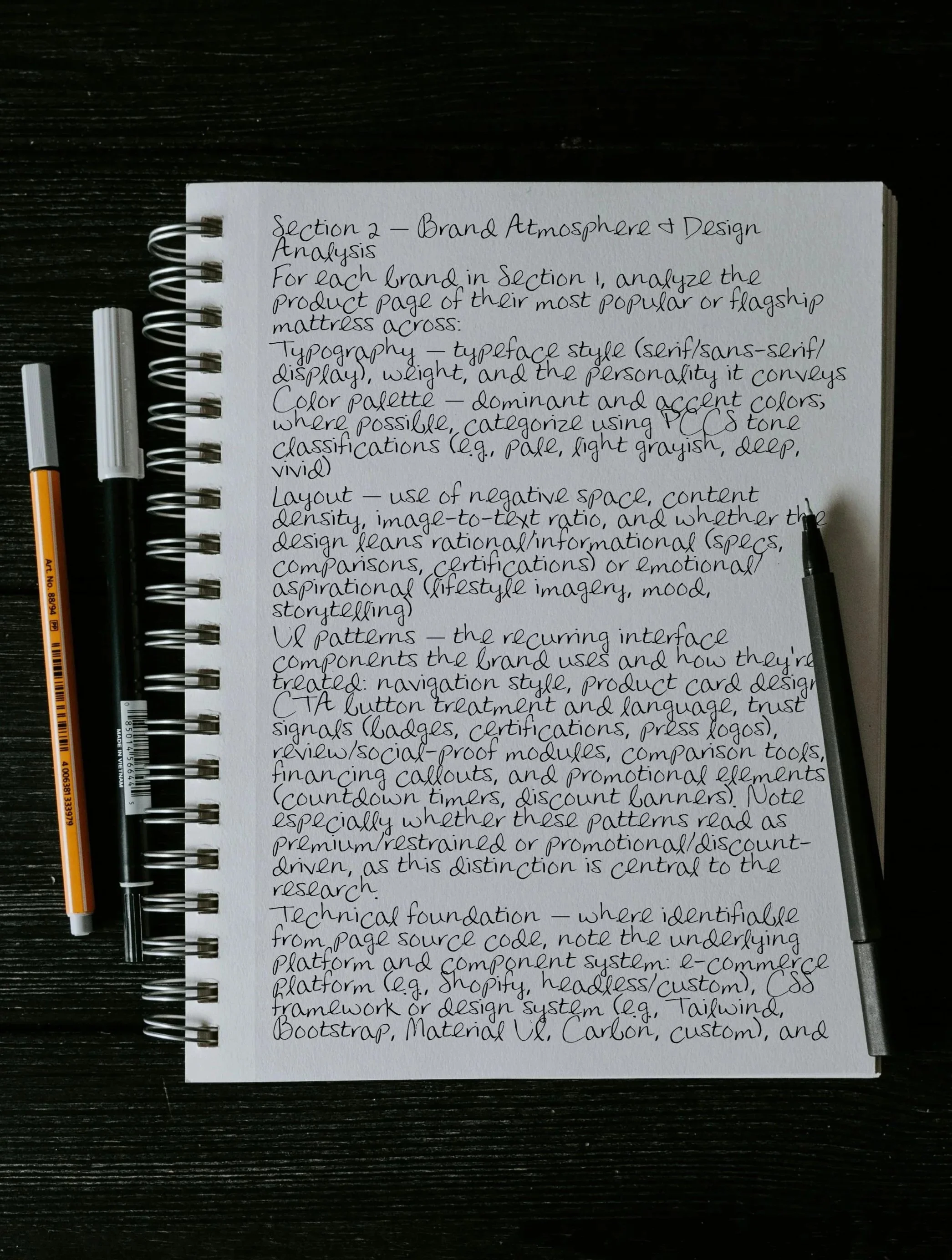
The Research Prompt
With its guardrails documented, adaptable to any competitive landscape
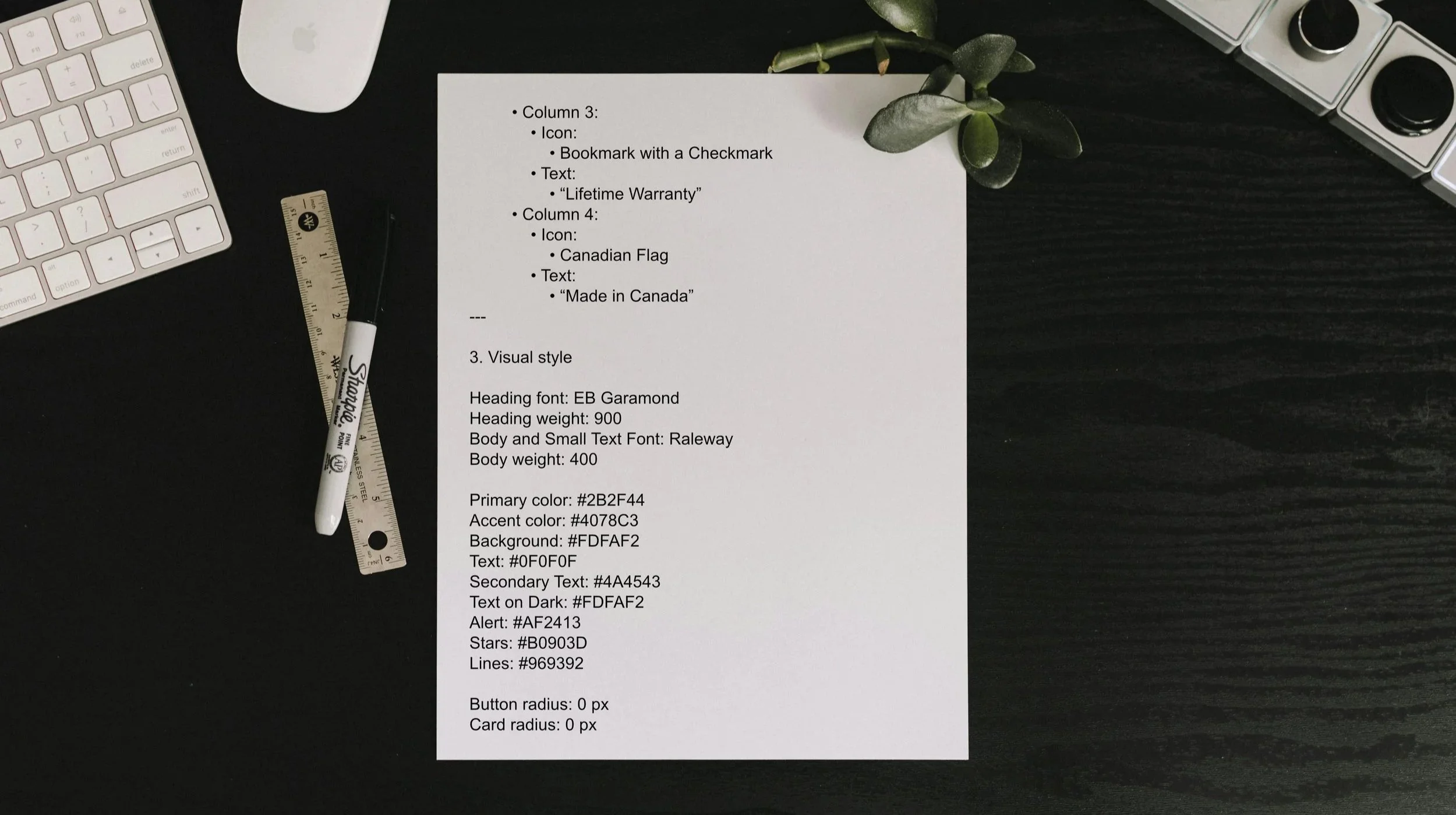
The PRD-to-Figma-Make Workflow
Including a designer handoff brief with iteration expectations, selection criteria, and escalation paths
Tools & Transparency
Claude: iterative development and pressure-testing of the research prompt; critiquing the image prompt's failure modes. Claude Research: executed the thirteen-brand competitive analysis with sourced business data. Figma Make: page generation from the PRD. Not AI: logo compositing in Affinity Photo 2; final design systematization done manually in Figma.
All strategic decisions, including the disagreements with AI-generated recommendations documented above, are mine.