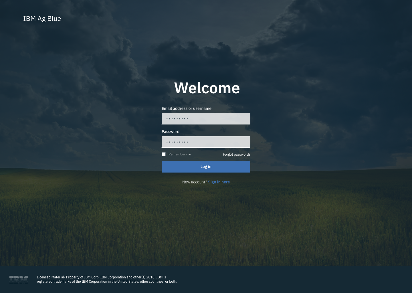
Ag Blue
IBM Patterns Program
This project is from my time at the IBM Patterns Program, which serves as an on-boarding for new full-time staff to IBM. Our team was made up of three project managers, two UX designers, one design researcher, and myself as a UX/UI designer.
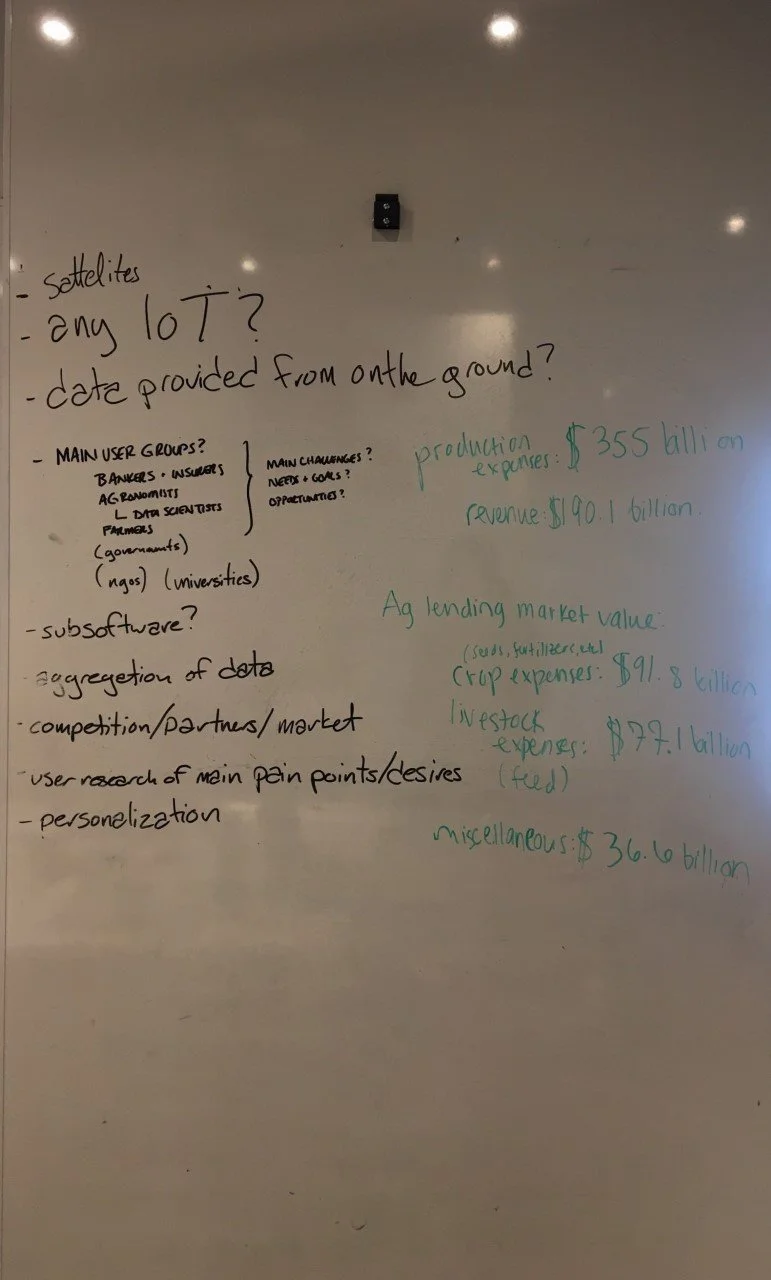
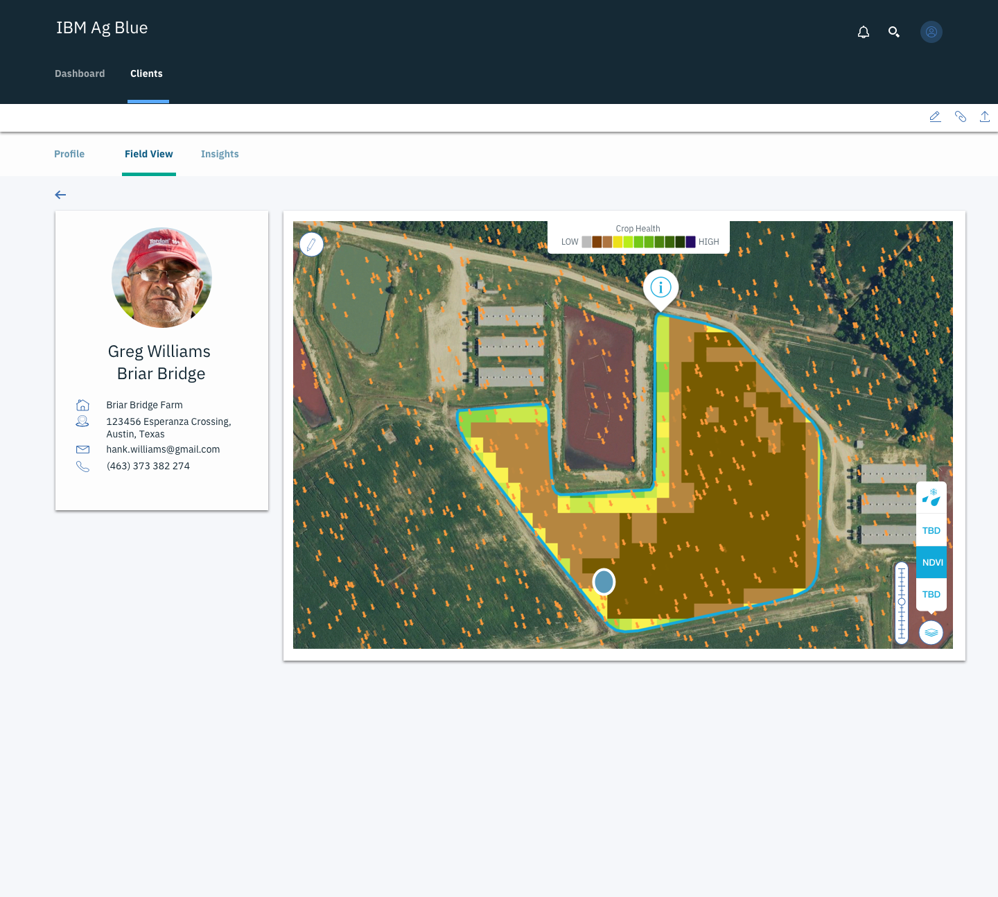
The problem we were given was how to best utilise the abundance of satellite information that The Weather Company had to improve farming. The product we settled on was Ag Blue (project name), an application that allowed farmers to have a detailed view of their farm's status. It also allowed those that provide funding to the agricultural community to monitor their investments and potential return.
Planning
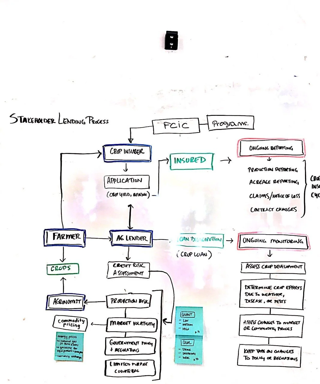
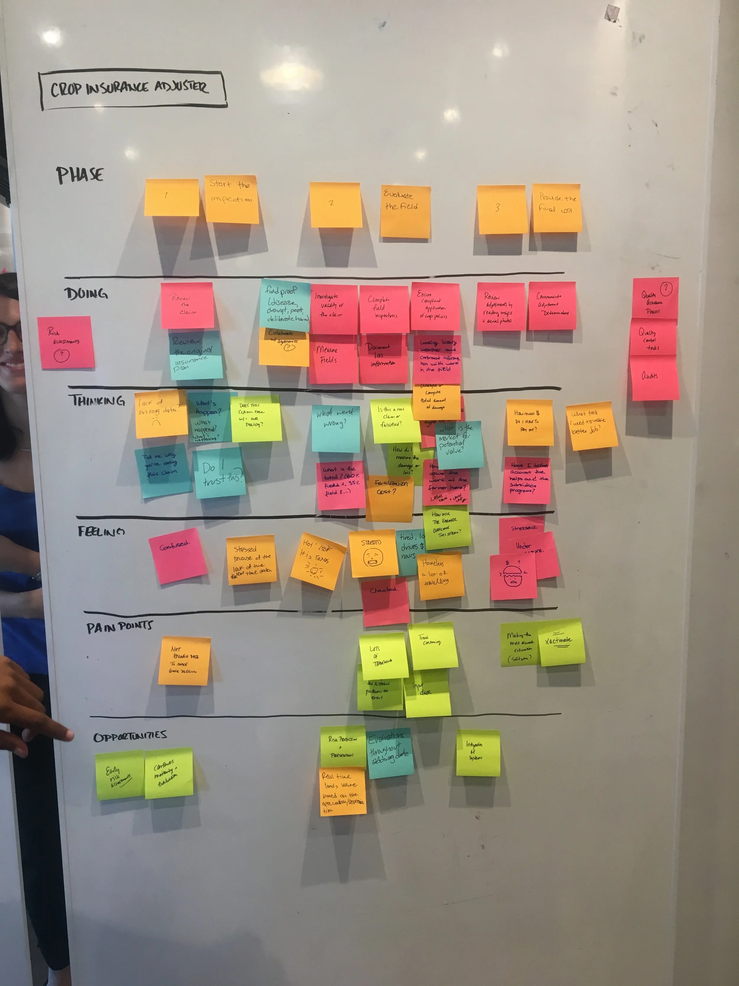
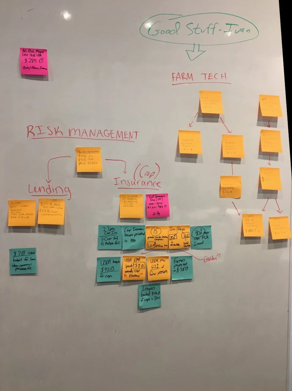
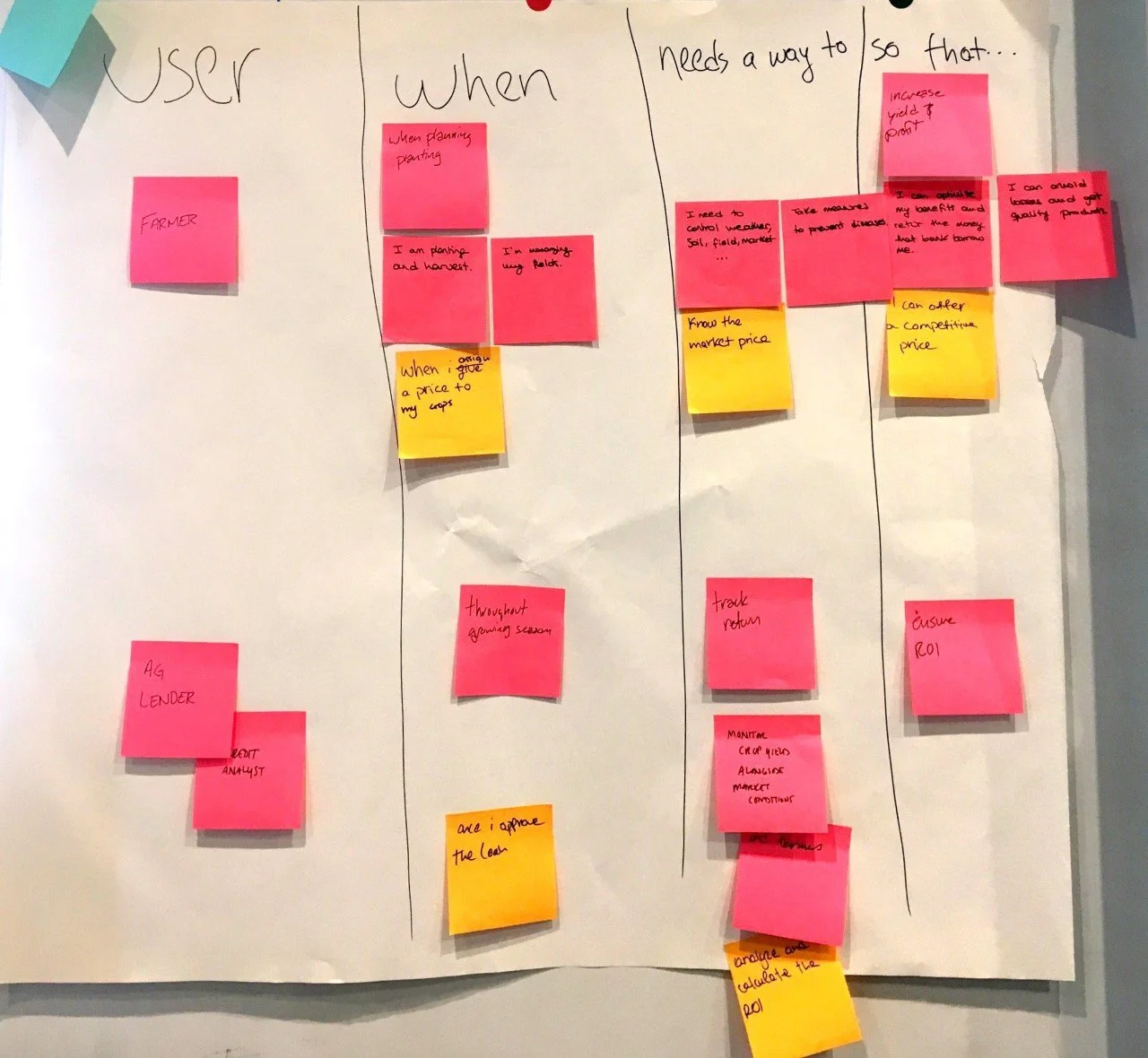
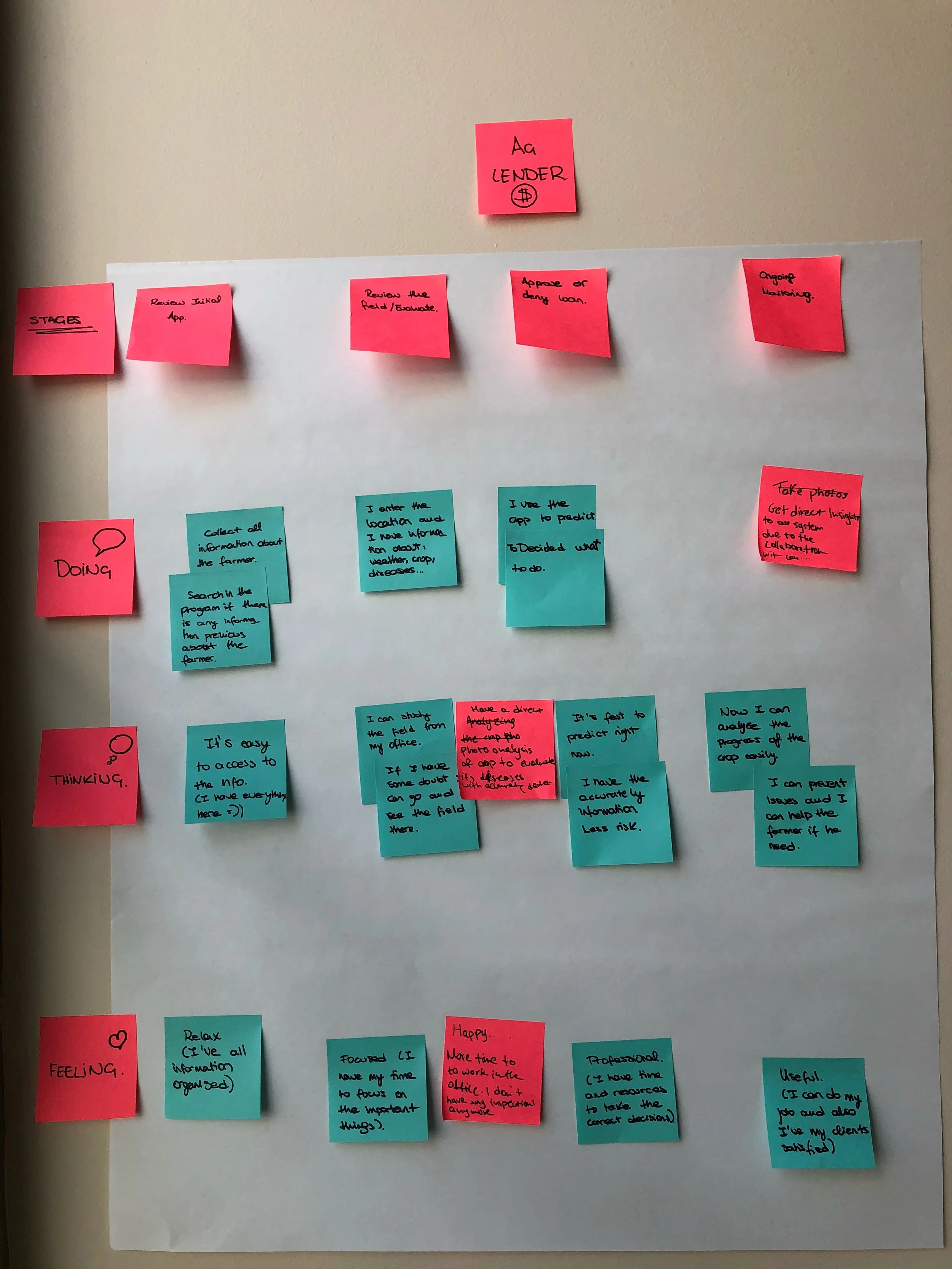
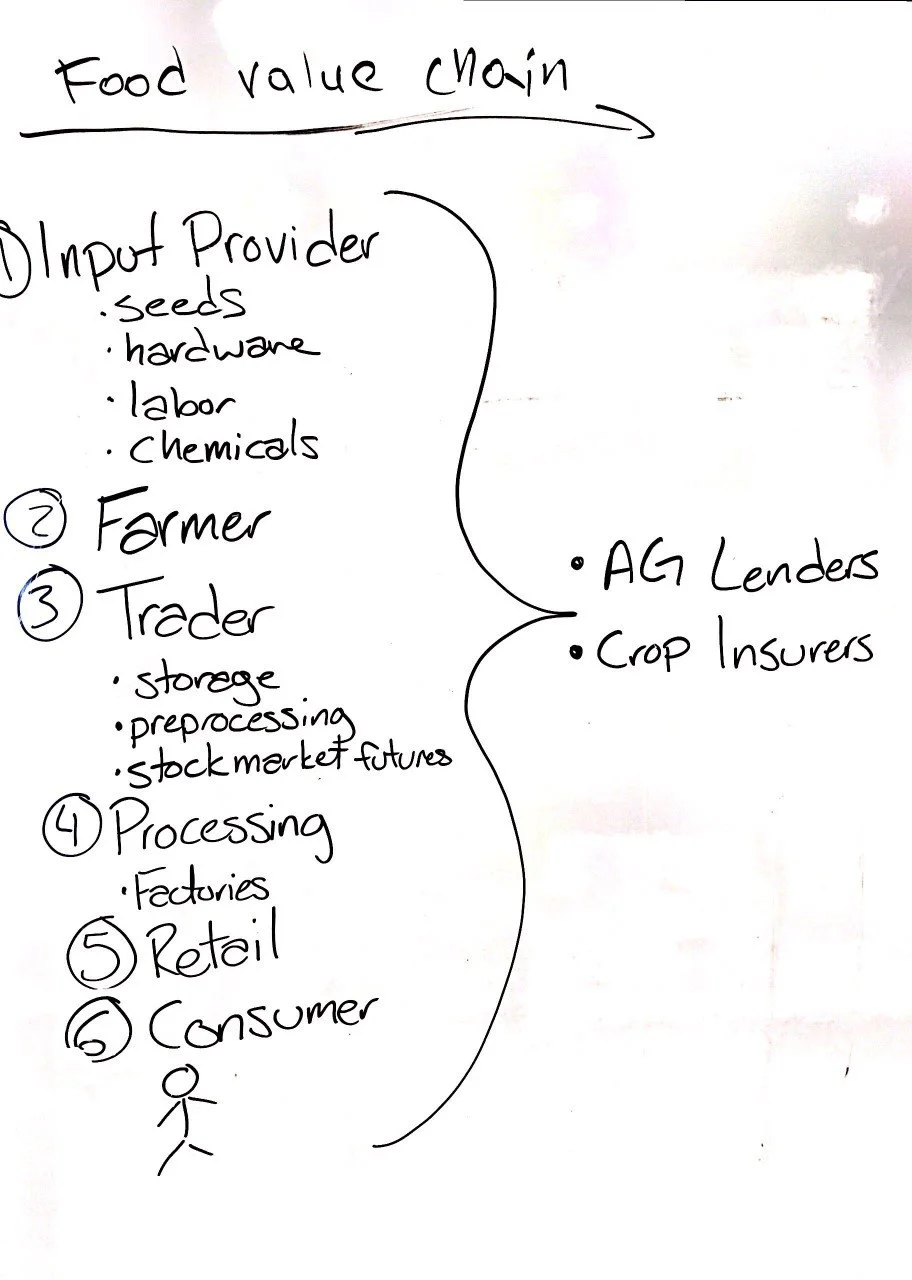
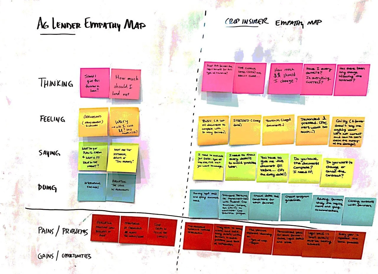
To reach this result we undertook in-depth research with 6 members of the farming, agricultural lending and insurance communities. From this we learned both the challenges, insularity and community we were attempting to break into. With this in mind, we wanted to ensure that the application we built was beneficial and affordable for farmers, rather than focusing exclusively on the lending and insurance community. The rationale was that if those being asked to track their farm would be unwilling to, the overall adoption of the product would be non-existent.
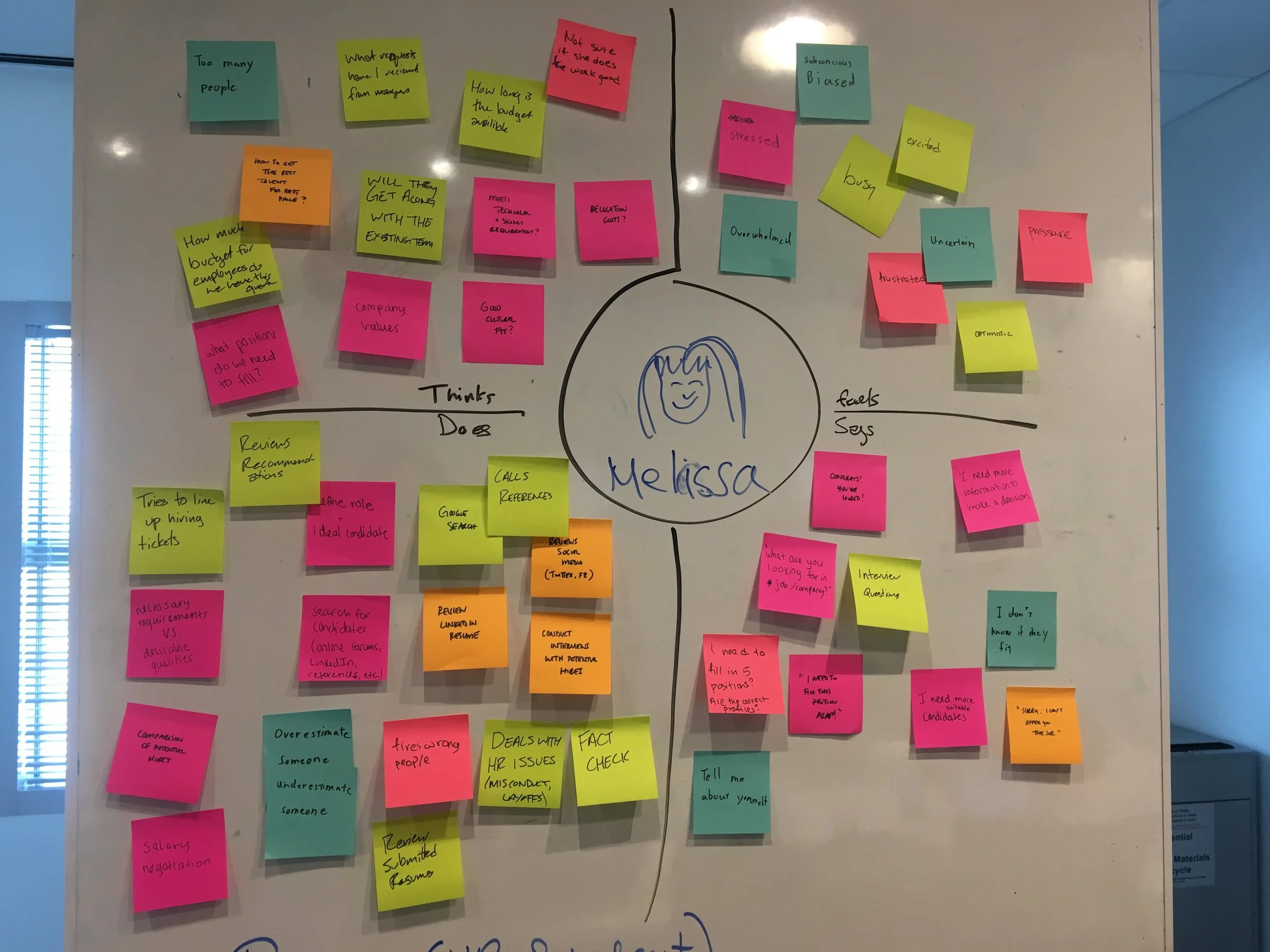
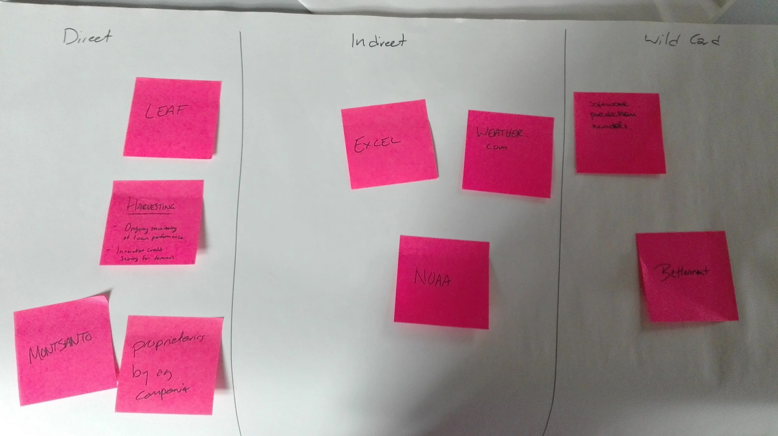
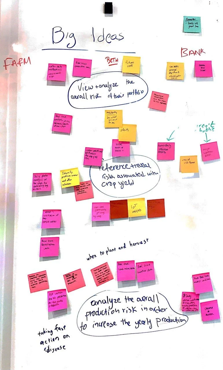
The functionality was then worked through using design thinking to find which features and ideas would be the best use of our remaining time.
Prototyping
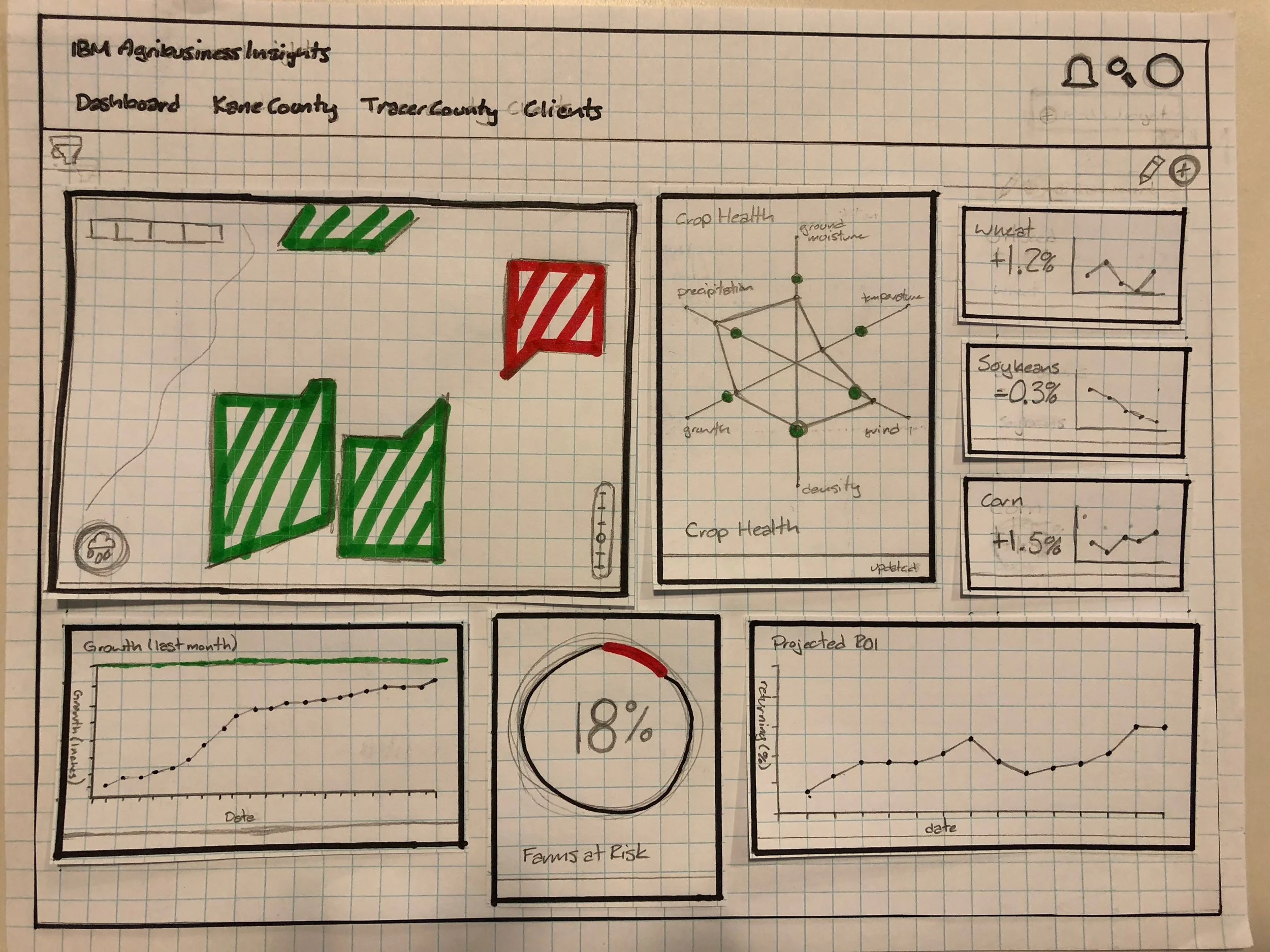
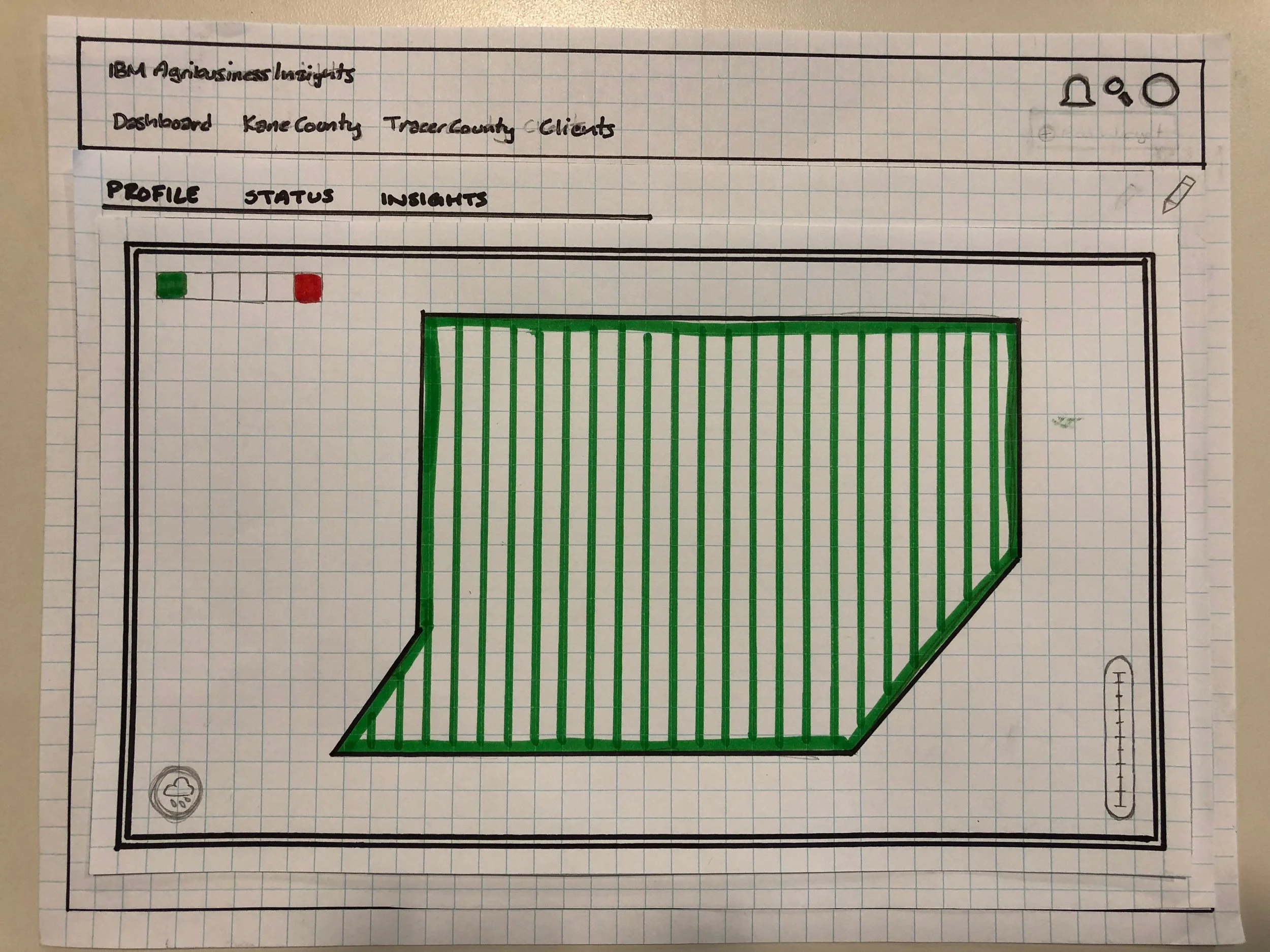
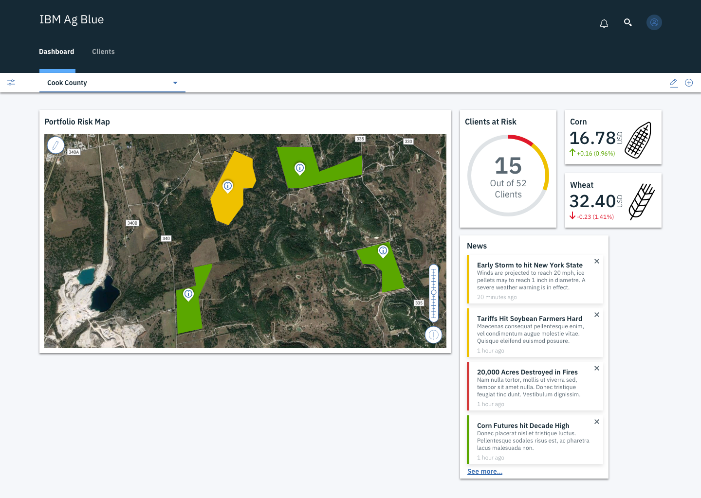
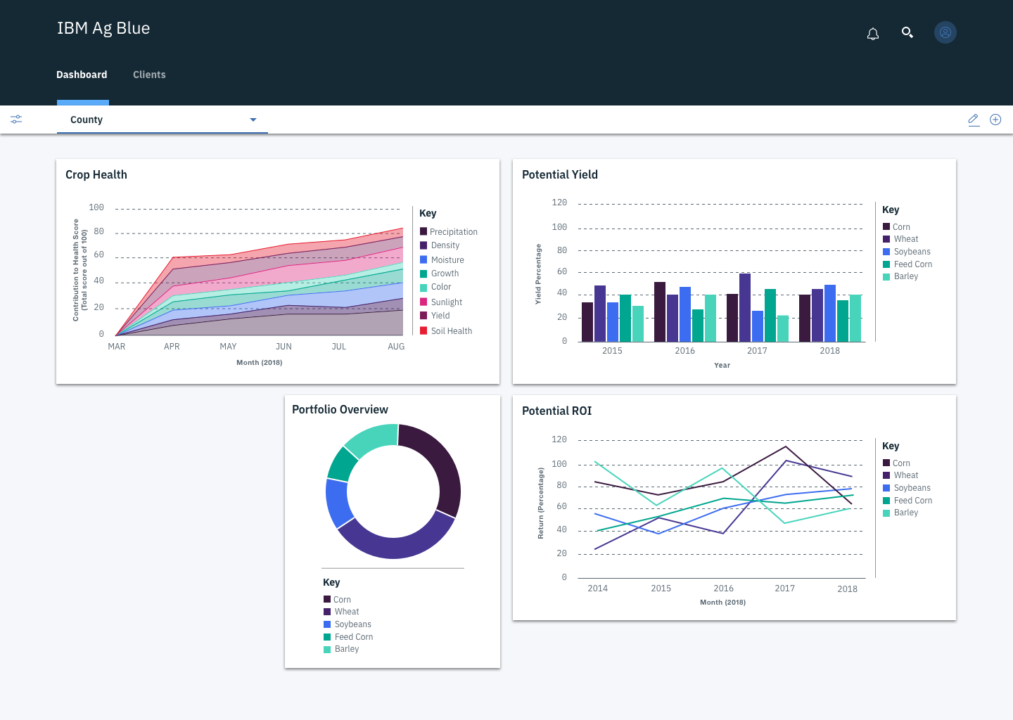
From the big idea development we figured out that the best focus of our time would be the dashboard. This would allow us to display the growth and potential of the product, while also creating the wow factor for clients and users that the full creation of this application is being pitched to.
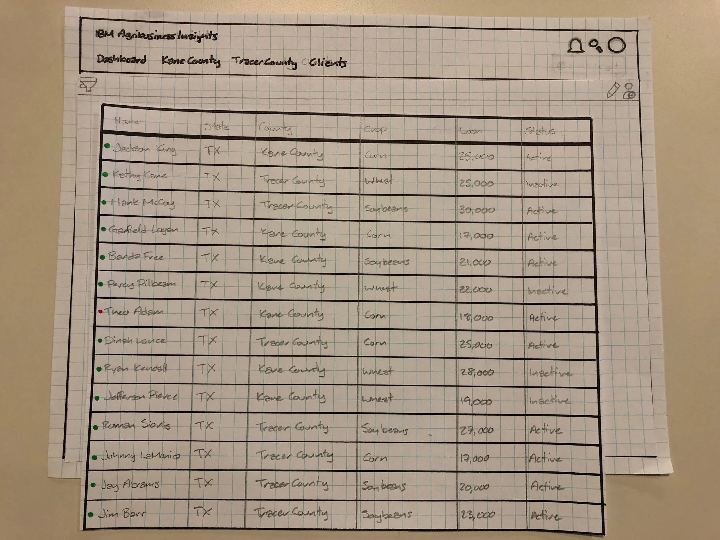
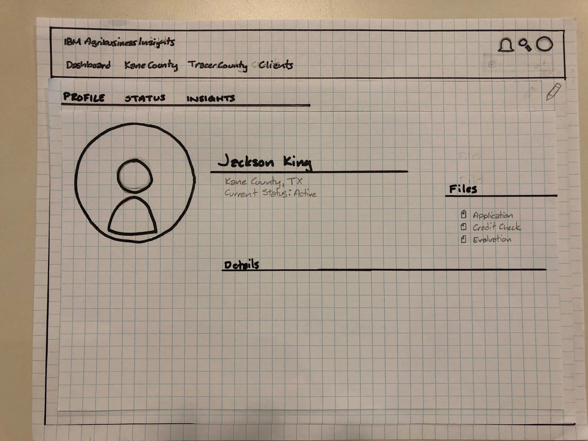
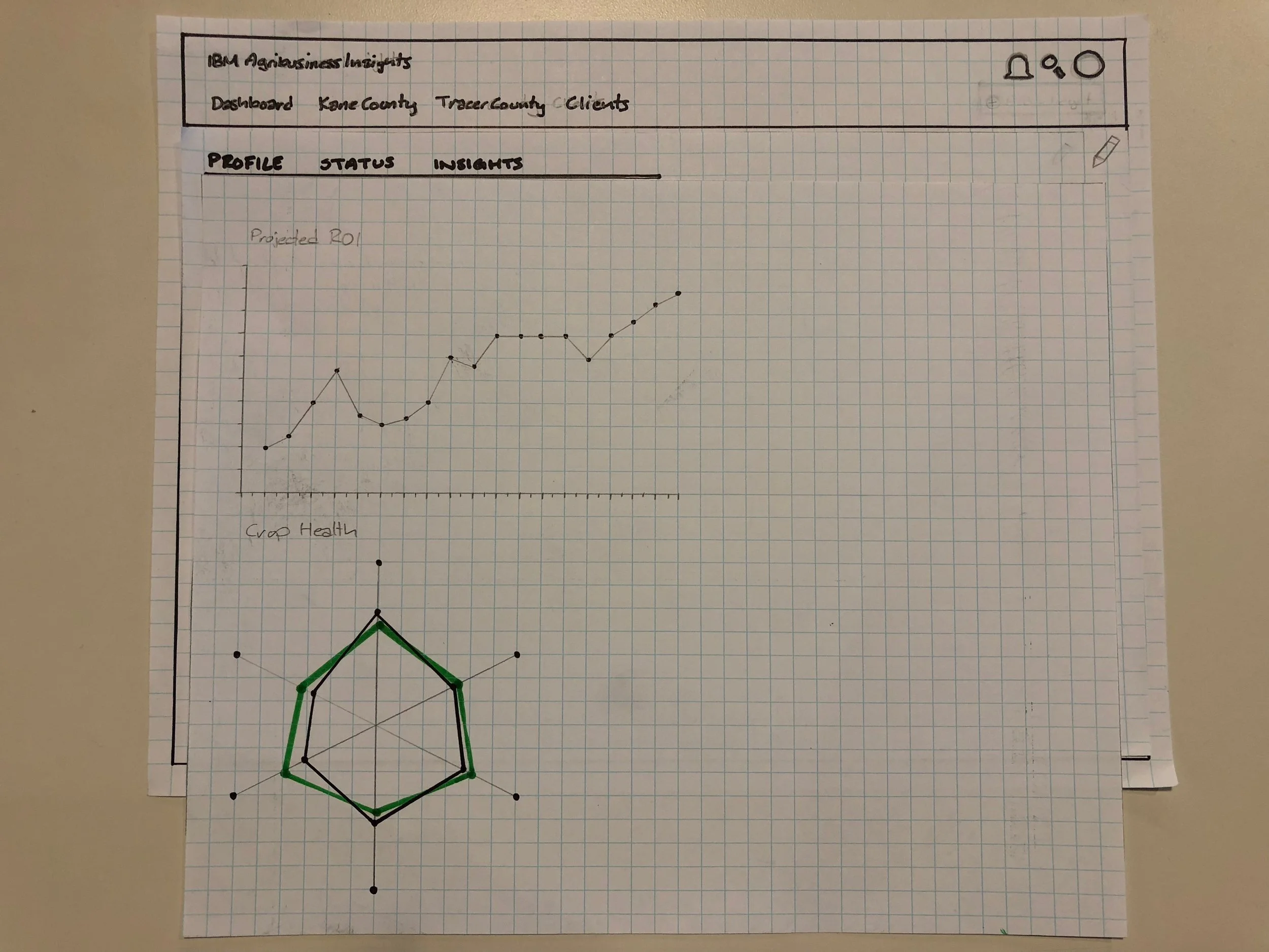
When we moved into formal design prototyping, I took the role of the lead designer, as both other UX designers on the team had only recently switched into the role, and I had been working at IBM on contract for two years. As such, I organised the team, delegating other sub-projects whilst I created a paper prototype to act as a guide for the rest of development. This was then tested with our sponsor users, and upon confirmation of usability, divided amongst the three of us.
Design
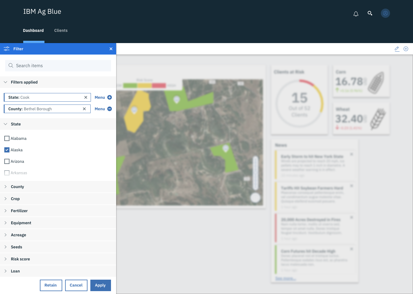
One team member focused on the universal design pieces we would need, like a top menu, profiles and filter. Another focused on the detail and in-depth profile views, whilst I focused on the main dashboard views. I also then took the final pass at the design, making all three designer's work match and look like a cohesive design for our final presentation, whilst the other designers were able to focus on the presentation itself.
